Preface
This is a slightly updated/modified version of this article, written by Wes Ruvalcaba (@wesruv), the creator of Basis (the default frontend theme of Backdrop). It is being republished here with his kind permission. Thanks Wes! ❤️
Introduction
My tooling is:
- Editor - Sublime Text 3
- Browser - Chrome 53.0.2785.116 m (ish)
- Working from Windows 10 onto an Ubuntu Server
It doesn’t really matter what the tooling is though, any code editor, modern browser, or functioning local setup will do fine.
Contents
- Setup for development
- Turn on theme debug
- Add site content
- Creating a theme
- Starting a sub-theme
- Customising a sub-theme
- Overriding header styles
- Component scaling with REMs and EMs
- Changing the header design
- Overriding a template file
- Adding pages
- Overriding component CSS
- CSS for mobile (smaller screens)
- Miscellaneous tips
1. Setup site for dev settings:
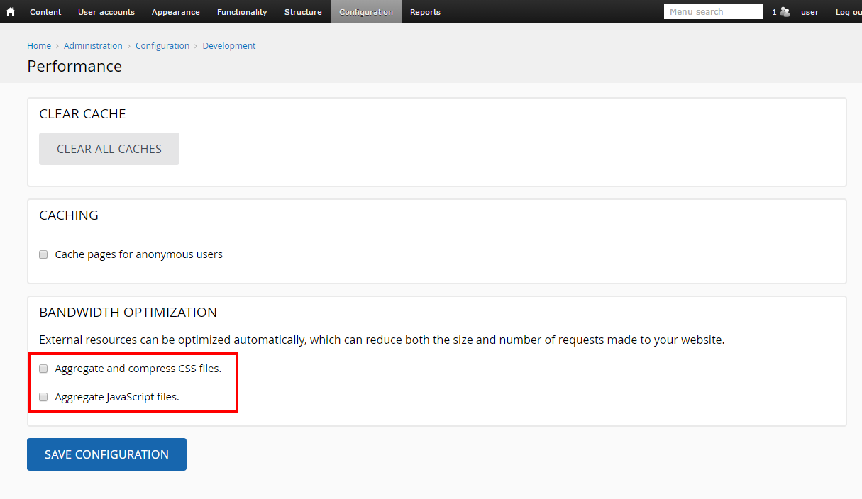
Turn off CSS/JS aggregation
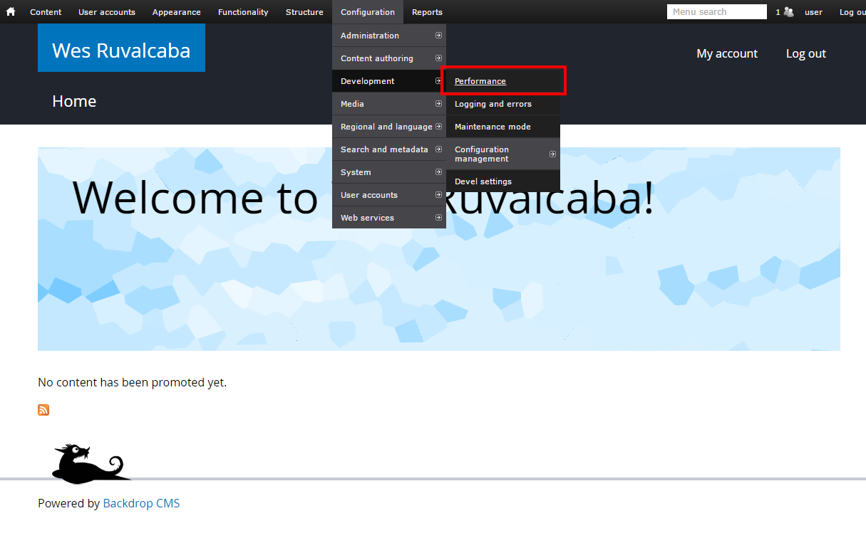
Go to Configuration > Development > Performance.
Untick the checkboxes for CSS and JS aggregation, and save:
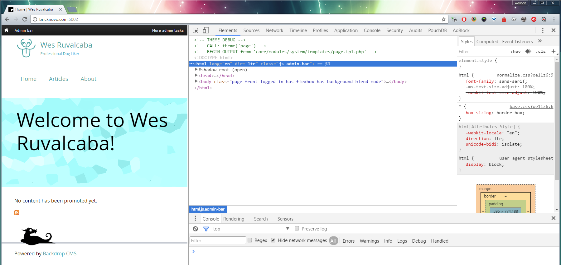
2. Turn on Theme Debug mode
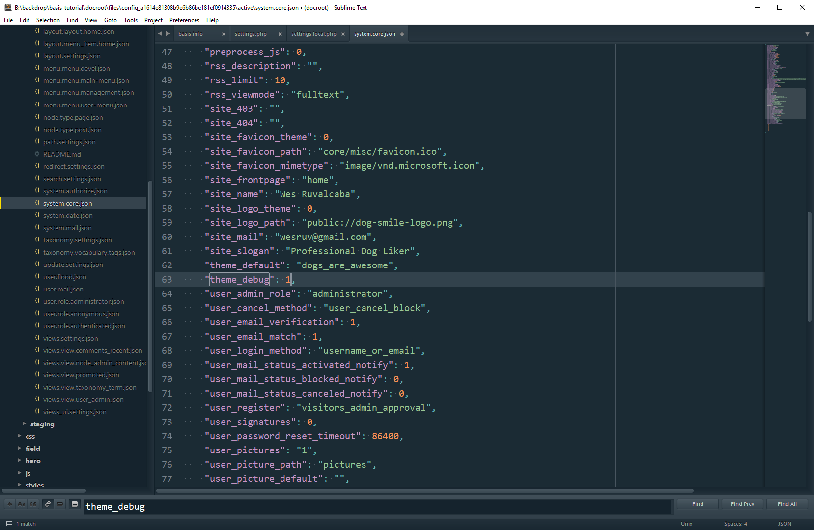
Edit the system.core.json file in your active config directory (by default files/config_*****/active).
Find the theme_debug setting within that file, and change its value to 1 to enable it (the default is 0, which means disabled).
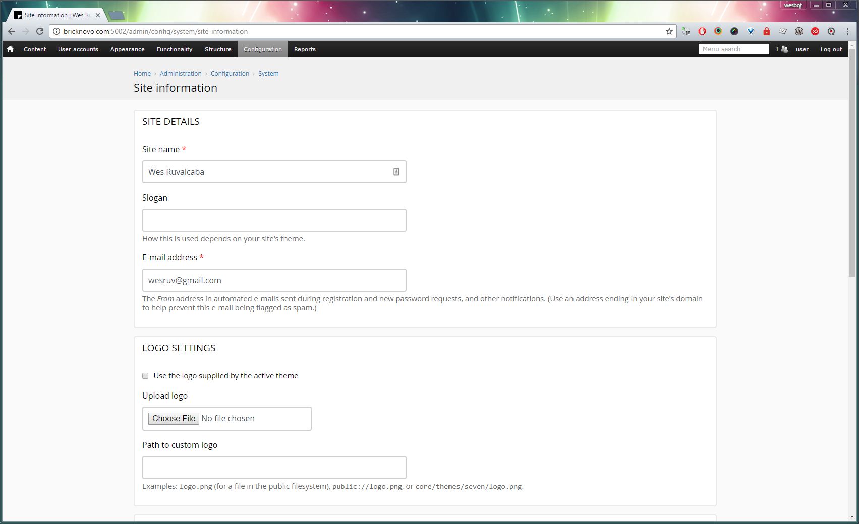
3. Add basic site content
Go to Configuration > System > Site Information.
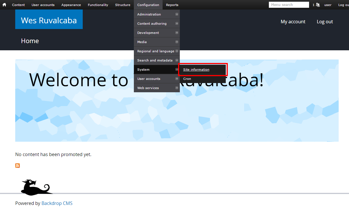
Add your logo, favicon, and slogan if you have one.
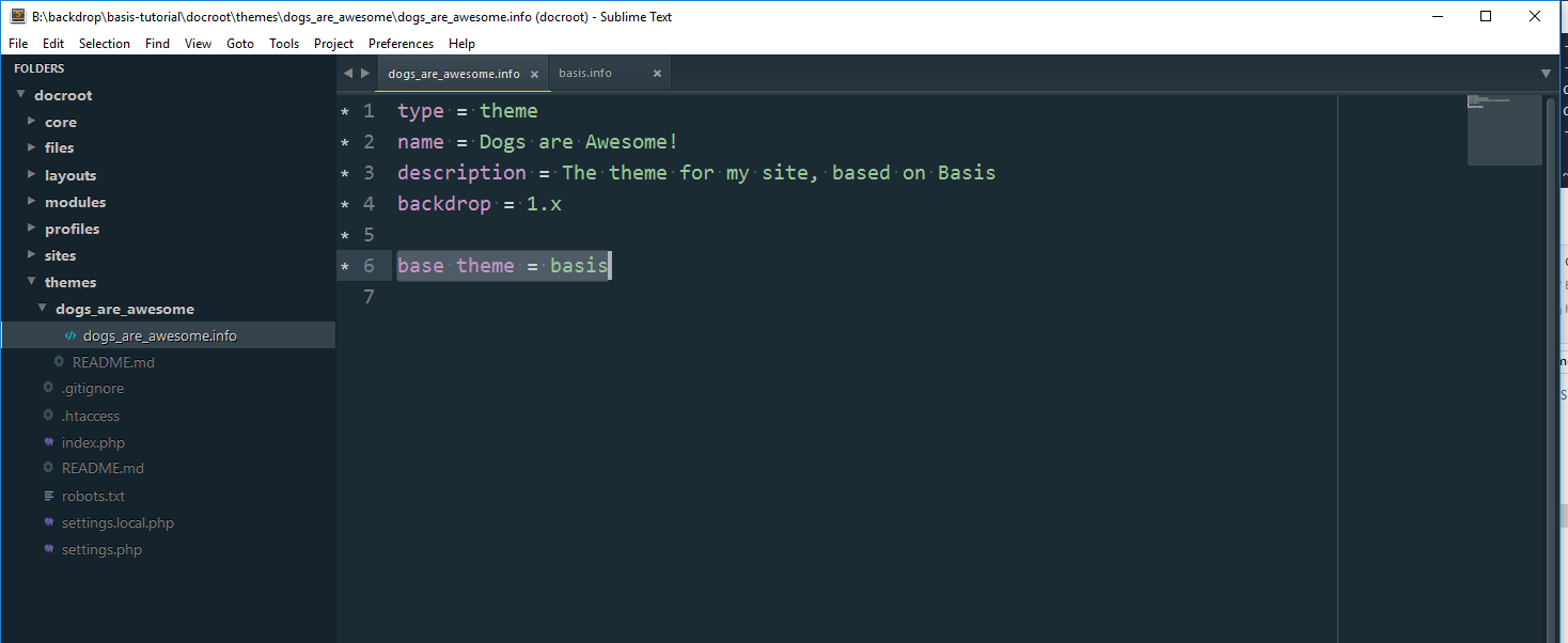
4. Creating a theme
Create a new theme folder, making sure to name it after the theme’s machine_name, which cannot have spaces, or dashes, or any special characters (replace any such characters with underscores).
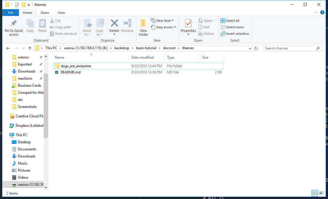
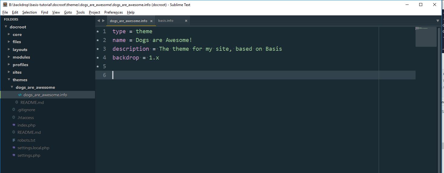
Then create a .info file. This file also needs to use the machine_name of the theme. In my case I’ve created the a new folder in themes/ called dogs_are_awesome/ and my info file is dogs_are_awesome.info
So the full path of my info file, from Backdrop’s root, is: themes/dogs_are_awesome/dogs_are_awesome.info
In my info file, I’ve added the basic information needed for a theme:
type = theme
name = Dogs are Awesome!
description = The theme for my site, based on Basis
backdrop = 1.x
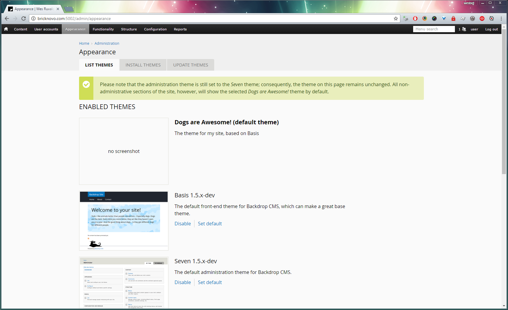
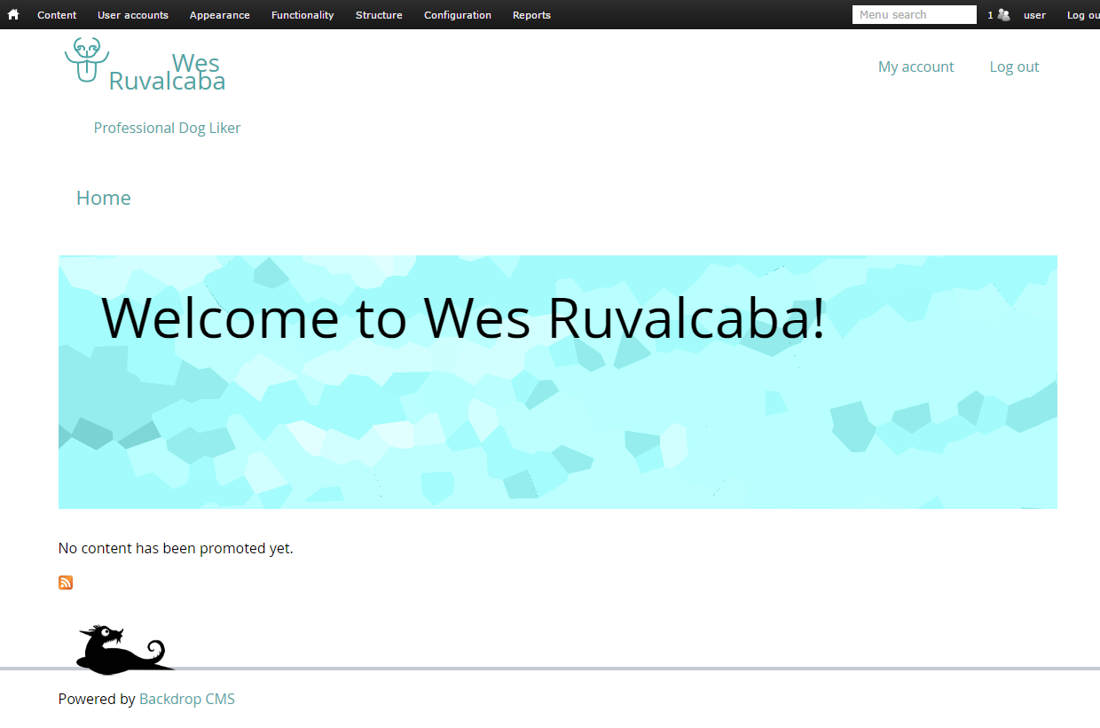
Now that we’ve created a theme, let’s enable it by going to Appearance > List Themes.
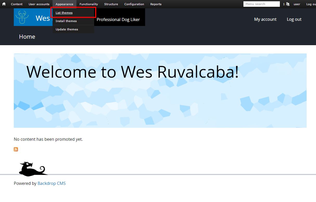
Find your theme, and click the Enable and Set Default link under its name.
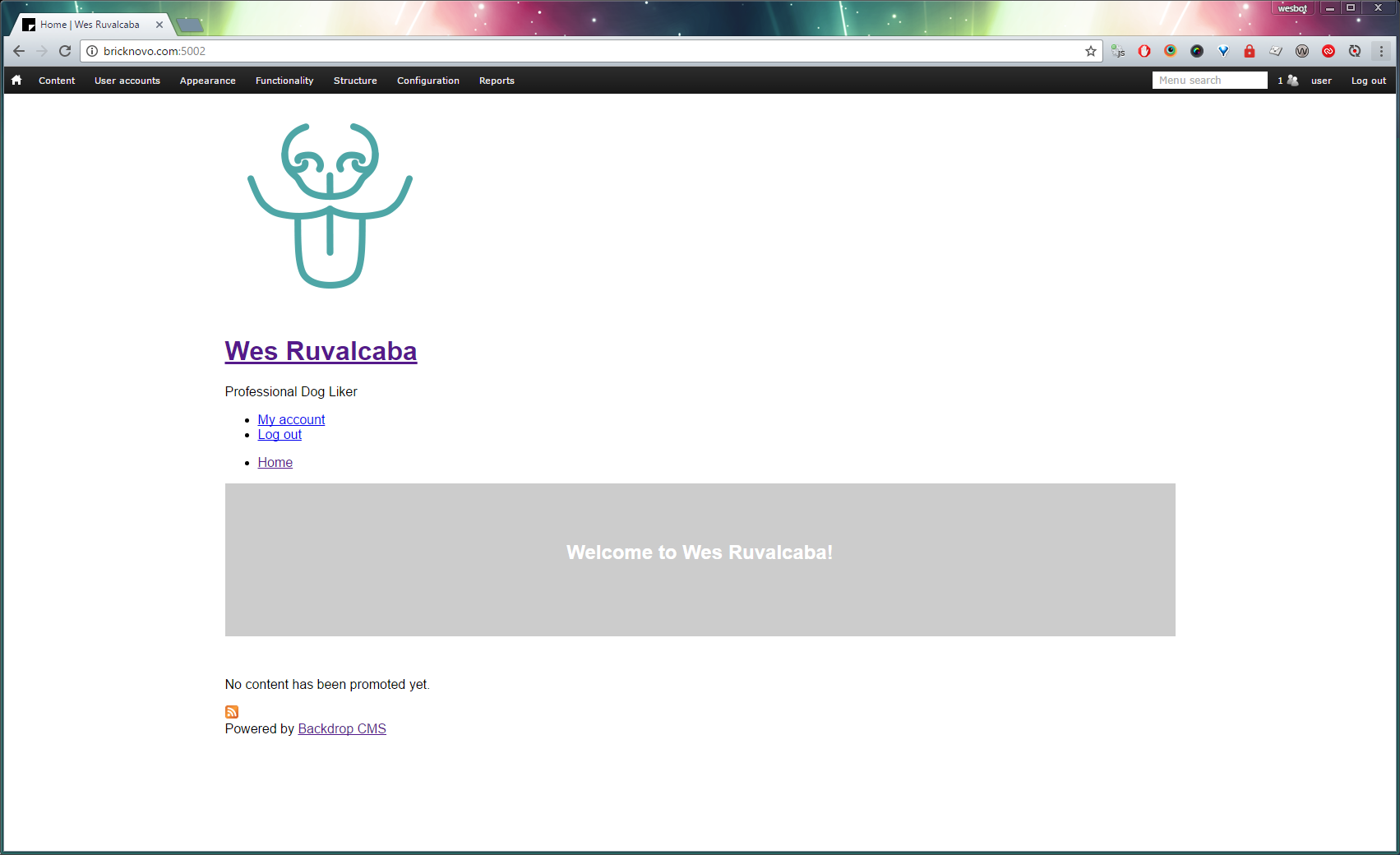
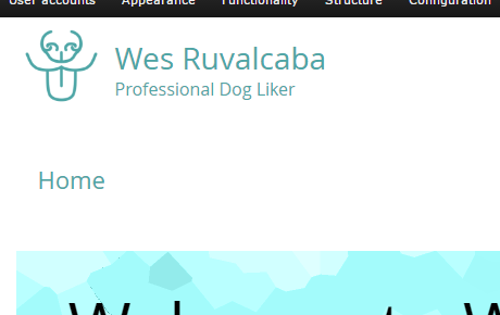
Going back to the homepage, you’ll notice that currently the site looks terrible! This is because we haven’t made it a sub-theme yet.
5. Make the theme a sub-theme
There's only one simple step to make your theme a sub-theme of another theme (Basis in this case); add this line to the info file:
base theme = basis
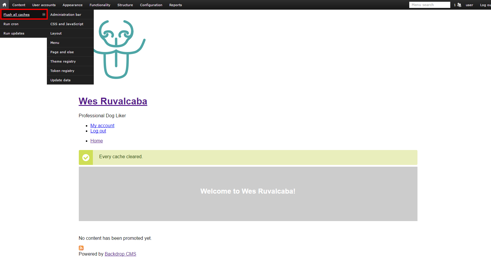
Whenever you have made a change to a .info file, added a new .tpl.php file, or added a new function to template.php, you’ll have to flush caches for things to take effect.
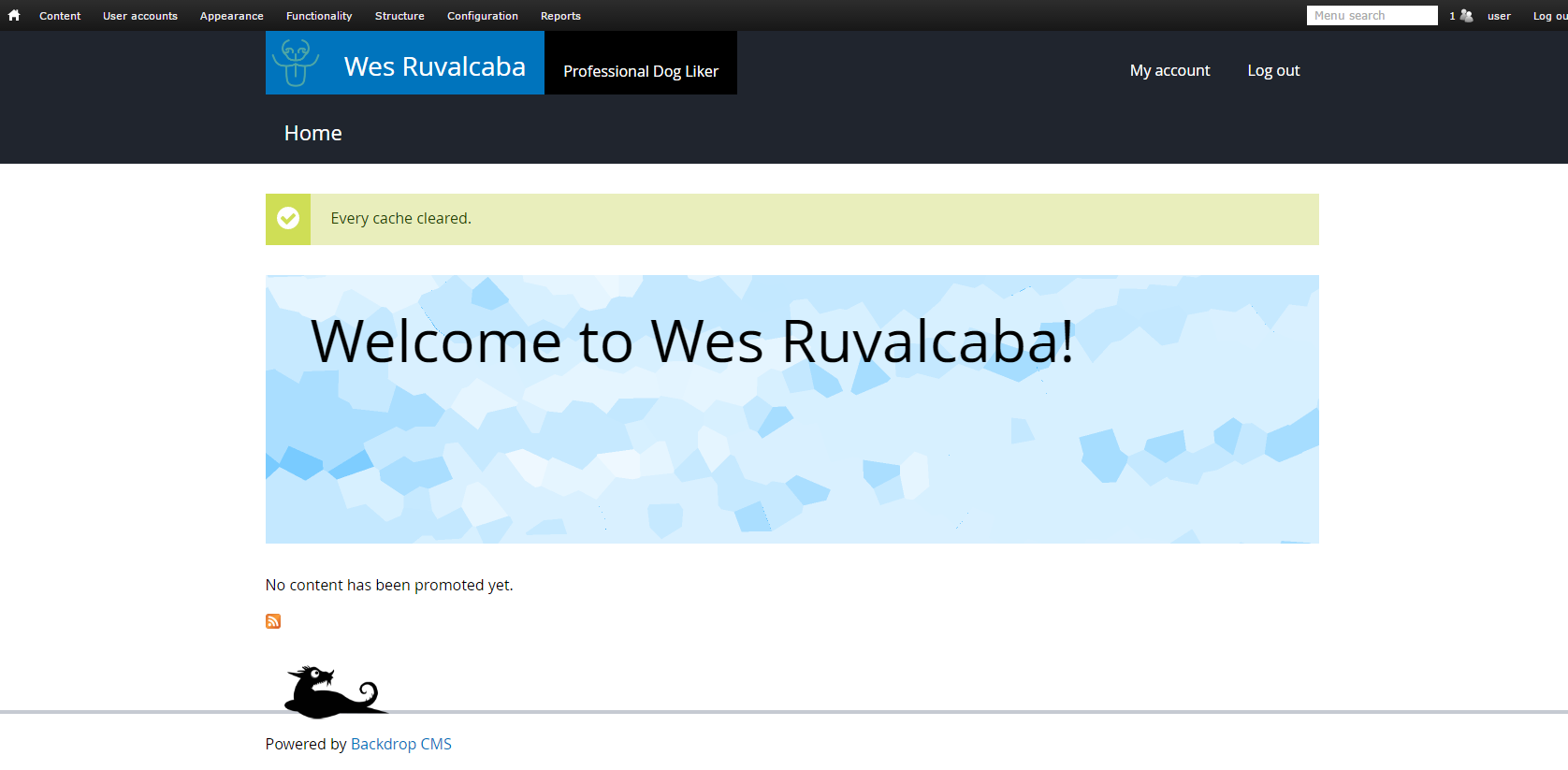
Hover your mouse over the House ⌂ icon in the top left of the admin toolbar, and then click Flush all caches.
Phew, looks a lot better now!
6. Updating a Basis sub theme to look like your brand
To start customizing Basis, we recommend overriding skin.css first. This file contains all of the color, image, and aesthetic styles for Basis.
We should be able to get our theme ‘most of the way’ towards looking the way we want it to, by overriding that file.
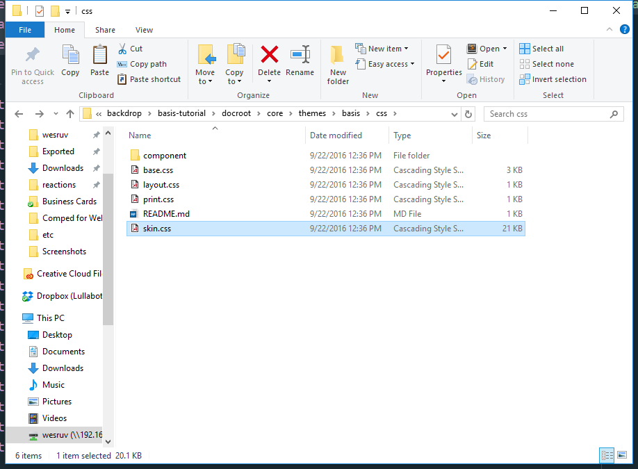
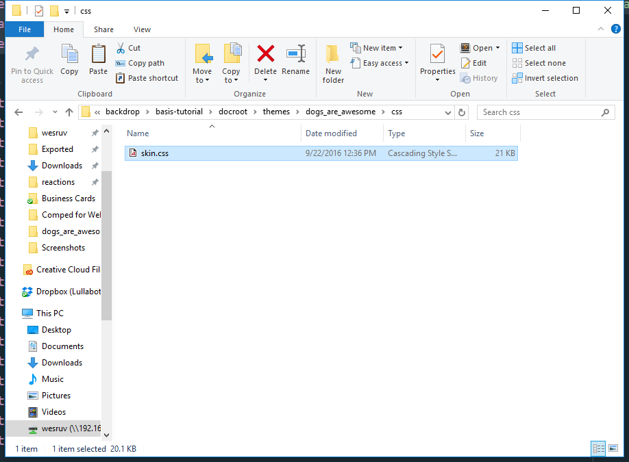
First we’ll copy skin.css and the images folder from Basis (core/themes/basis/css/skin.css and core/themes/basis/images) into our theme. I’ve made a css/ directory in my theme, you don’t have to, but it will feel more organized if you end up having a lot of files in your theme.
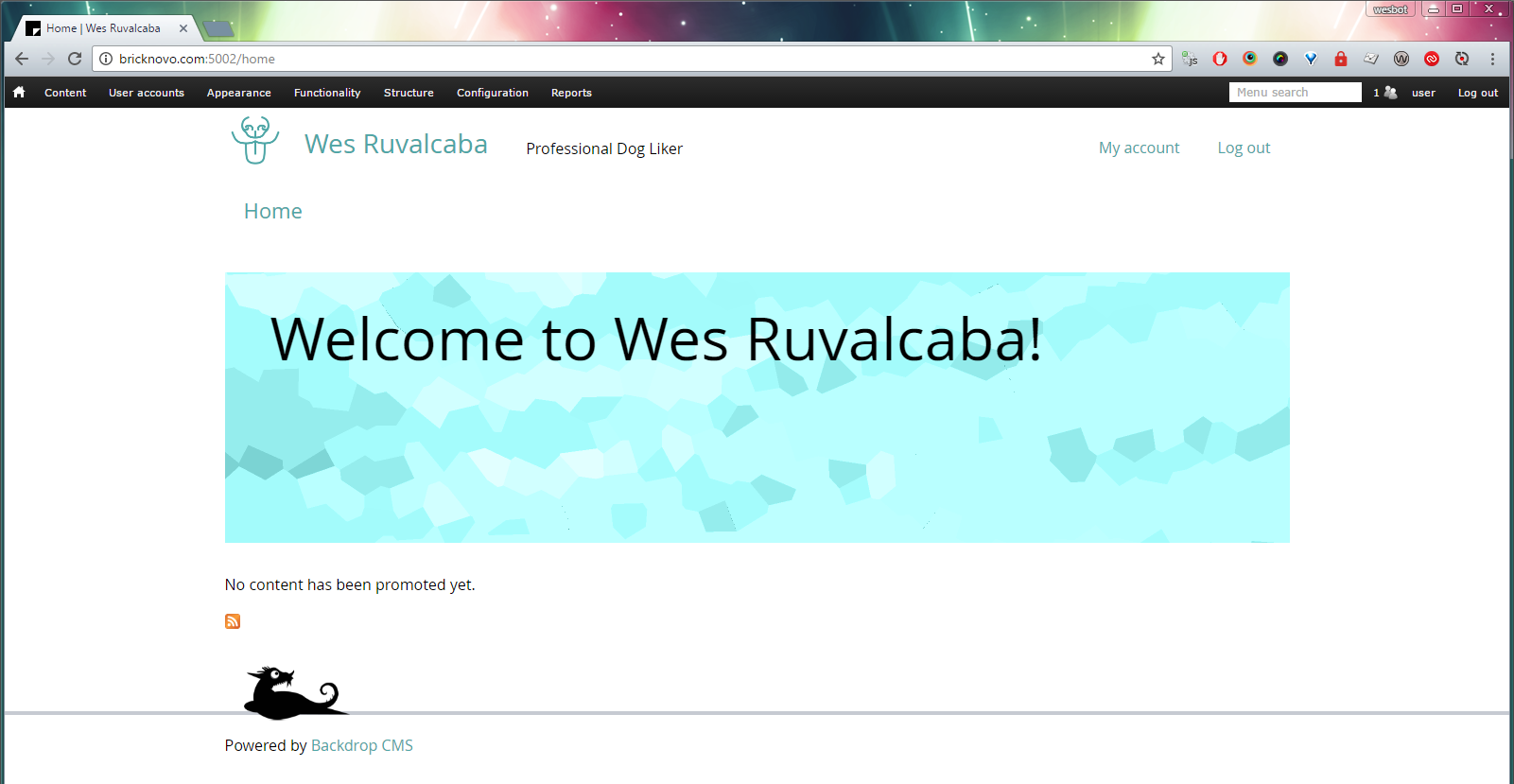
Open skin.css. Let’s start by doing a find-and-replace on the link color (#0074bd), with what we want the links to be; then save the file.
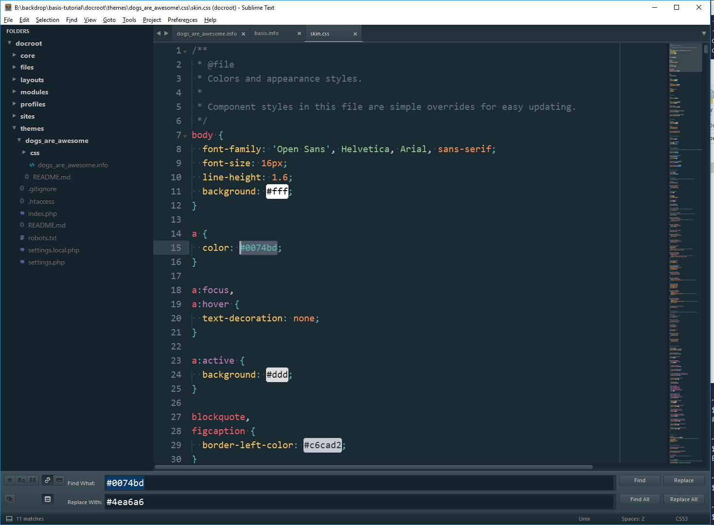
Refresh page… link color hasn’t changed…
This is because we haven’t informed Backdrop that we have a replacement* file. We can override* files in our base theme by adding them to our .info file, with the same file name.
Open your sub-theme’s info file (mine being dogs_are_awesome.info), and add:
stylesheets[all][] = css/skin.css
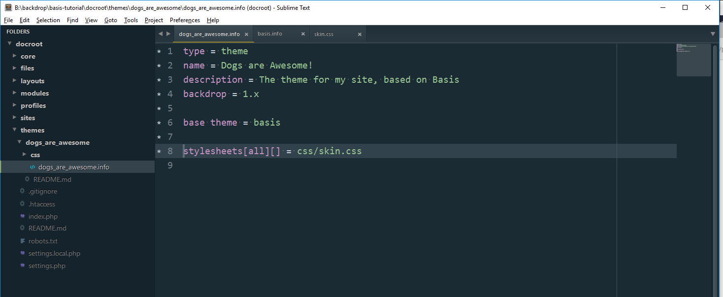
File paths in the info file are relative to the .info file, and should not reference any files that aren’t inside of the same theme. We can use this method to override* any CSS files that appear in Basis’ .info file, or add completely new files.
* Doing this means the original file from Basis will not be loaded at all. This is great if it’s your intention; but if you would prefer to add your styles on top of what’s in skin.css, rather than overriding it, then I recommend creating a new (blank) file, with a slightly different name (like my-theme-skin.css).
Flush cache again, because we made a change to a .info file.
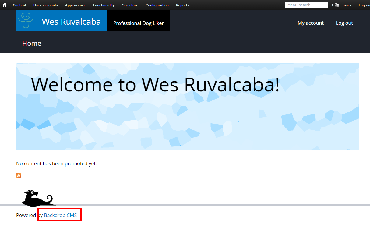
Now we see our color updates:
Let’s keep going. I’d like my theme to have a white header, to match the page. So I’ve made the following changes in my sub theme’s copy of skin.css:
- Change or remove
.l-headerbackground color (this will show the site’s background color -white- and remove the slate). - Remove
.l-header-inner‘scolor, as we don’t want white typography on a white background. 😄 - Remove link and link state under menu and header colors, so they inherit and look good on a white background.
- Remove the background color from the slogan
- Remove the background color from the site name
Now I’d like to update the Hero coloring:
Update .block-hero-no-image and .no-background-blend-mode .block-hero-no-image:before with the desired background color. If the color is subdued, make a brighter (lighter and more saturated) version for the latter selector.
7. Overriding Header styles
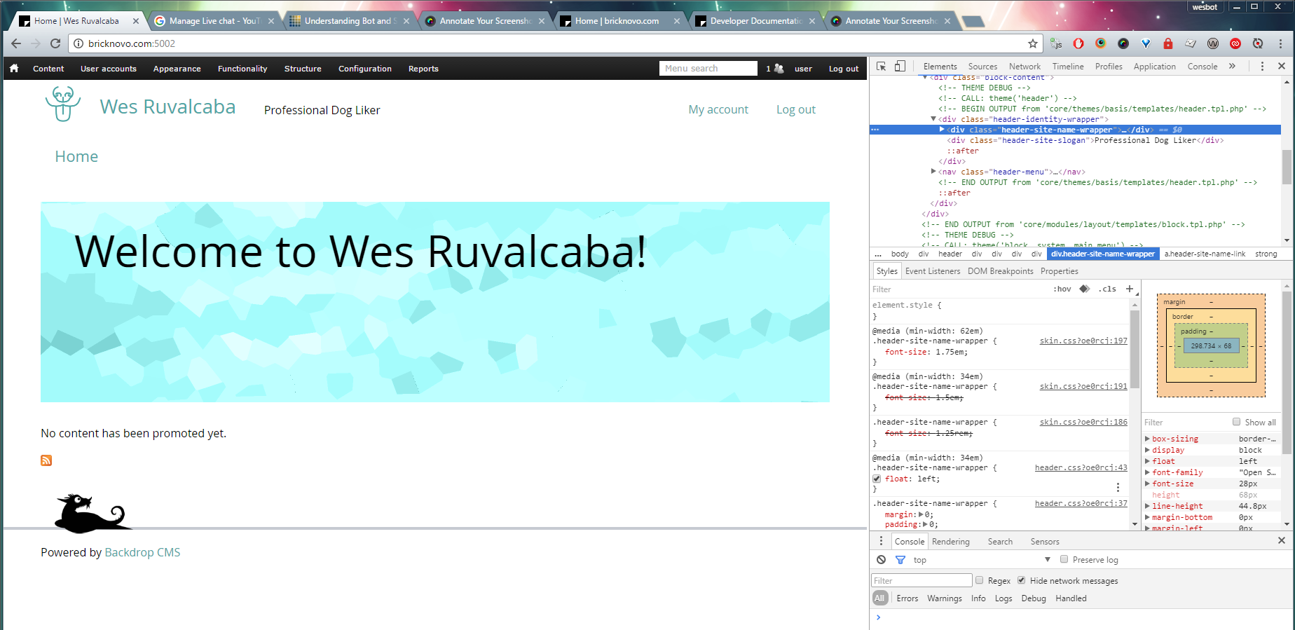
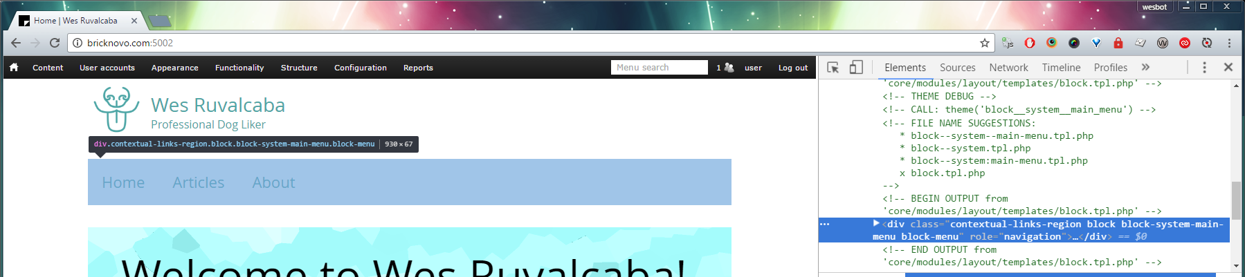
For this theme, I’d like to have a larger logo, and I’d like to put the main menu next to the logo, instead of underneath. This is getting into the layout of a component, if we inspect the header markup, you’ll see most of the styles coming from skin.css, and a few from header.css.
If you don’t see skin.css or header.css but instead see file names like css_asdlfjkaasdfadf, this is because CSS aggregation is on, see how to turn it off at the top of this article.
Because a site’s header is so likely to change, we put a lot of the layout styles for the site name, logo, slogan, and header menus in skin.css. The styles that are in header.css probably won’t need to be touched; those styles setup a few basics.
8. Component Scaling with REM’s and EM’s
You may notice that most styles are based on REM’s and EM’s, with very few if any px units in use. Using rem and em units can come with a little more overhead, but they also come with greater flexibility and sturdiness, and work much better with some accessibility features.
If you see weird decimals, know that generally rem and em units are dealing with multiples of 1/16th. This is because the default font size of most browsers is 16px.
If we simply want to increase the size of the header, or a few of its parts, we can do this very quickly, by adding a few lines of CSS.
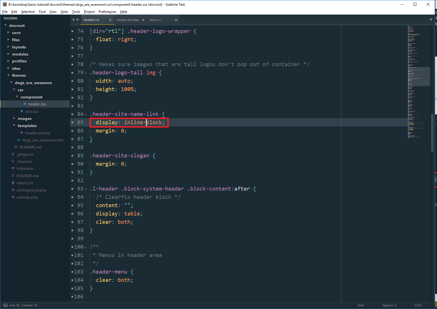
Each component file revolves around a wrapper. In the case of header.css that wrapper is .l-header. If we change the font-size of the wrapper, everything inside will scale proportionately, because Basis was coded with every internal ‘component part’ defined in em units.
So by adding one line to the header styles (look for Header Region in skin.css), we can upscale or downscale the whole header:
  .l-header {
    font-size: 1.25rem;
  }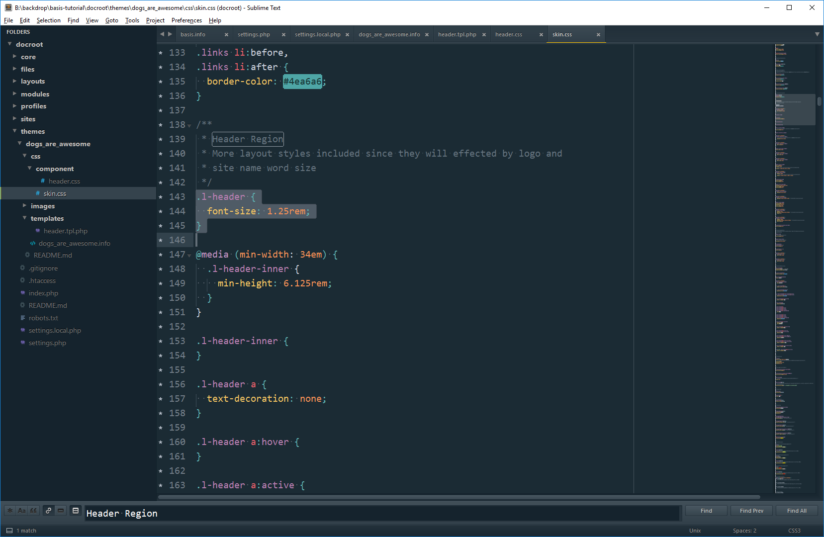
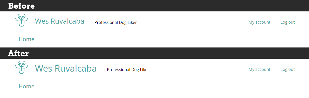
With that one line, everything in the header has been scaled up by 25%.
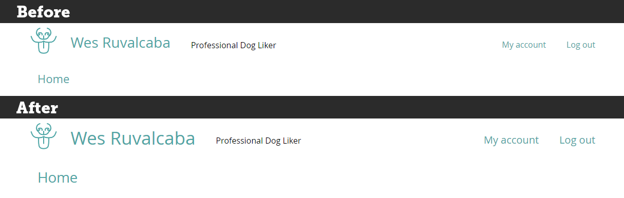
You may also want to scale up individual parts, and not the whole component. I may want to increase the size of the .header-identity-wrapper, but nothing else in the header.
To do this, I would find the other styles for that part of the component, and add font-size: 1.25em; to the .header-identity-wrapper styles.
For this example we could use rem or em, depending on what you want. If you’d prefer that the .header-identity-wrapper picks up any scaling done outside of it (e.g. if we added the 25% scaling to the header wrapper), then use em.
If instead you prefer that .header-identity-wrapper doesn’t scale if it’s parent is scaled, use rem. It will prevent scaling from effecting it and its children elements.
It’s best not to get too crazy scaling things up and down by using the font-size on the wrappers, it could get hairy. I try to keep most of my font-size styles on the lowest level, as close to the text and content as possible (like p, a, .site-name), or on the major component wrappers (like .l-header, .hero, .breadcrumb, etc).
For instance, let’s say we had a footer menu that looked something like this:
<div class="block-footer-menu">
  <h3 class="block-title">Footer Menu</h3>
  <ul class="menu">
    <li class="leaf">
      <a href="#">Page</a>
    </li>
    ...
  </ul>
</div>
I might want to make my footer menu font a little smaller, I might do something like this:
.block-footer-menu {
  font-size: 0.8125rem;
}

.block-footer-menu .block-title {
  font-size: 1.25em;
}
Everything in the .block-footer-menu will be a little smaller now, and on top of that, the .block-title to be a little bigger than the links.
I add font-size to .menu, or .leaf. Adding it to those ‘in-between’ elements could create some weird inheritance that you don’t expect.
If we wanted to, we could add a font-size to .block-footer.menu .leaf a . That wouldn’t come back to bite us, but in this case it’s probably best that it inherits the default font-size for this component, which we set as 0.8125rem (which on a default setup will come out to 13px).
To find out more about rem or em units, or this component scaling strategy, you can read: https://www.lullabot.com/articles/scaling-css-components-with-bem-rems-ems
Setting a default font-size for your theme
Basis’ default font-size is inherited from the browser default size, which is usually 16px. I recommend to keep that size; but if you feel your design should have a different size, add a font-size in rem units on the body element (see the top of skin.css).
9. Implementing a different header design
To do this, you’ll want to be fairly comfortable with CSS, good enough to be dangerous.
Let’s say I wanted my site header to look like this:

Big differences are:
- Bigger logo
- Bolder type
- Slogan under the site name
- Main menu along side the site’s identity
- Removed Account Menu
Looking at the markup, I think I want to make a change to the identity area. I’d like to have the slogan grouped with the site name, instead of being next to it in the markup.
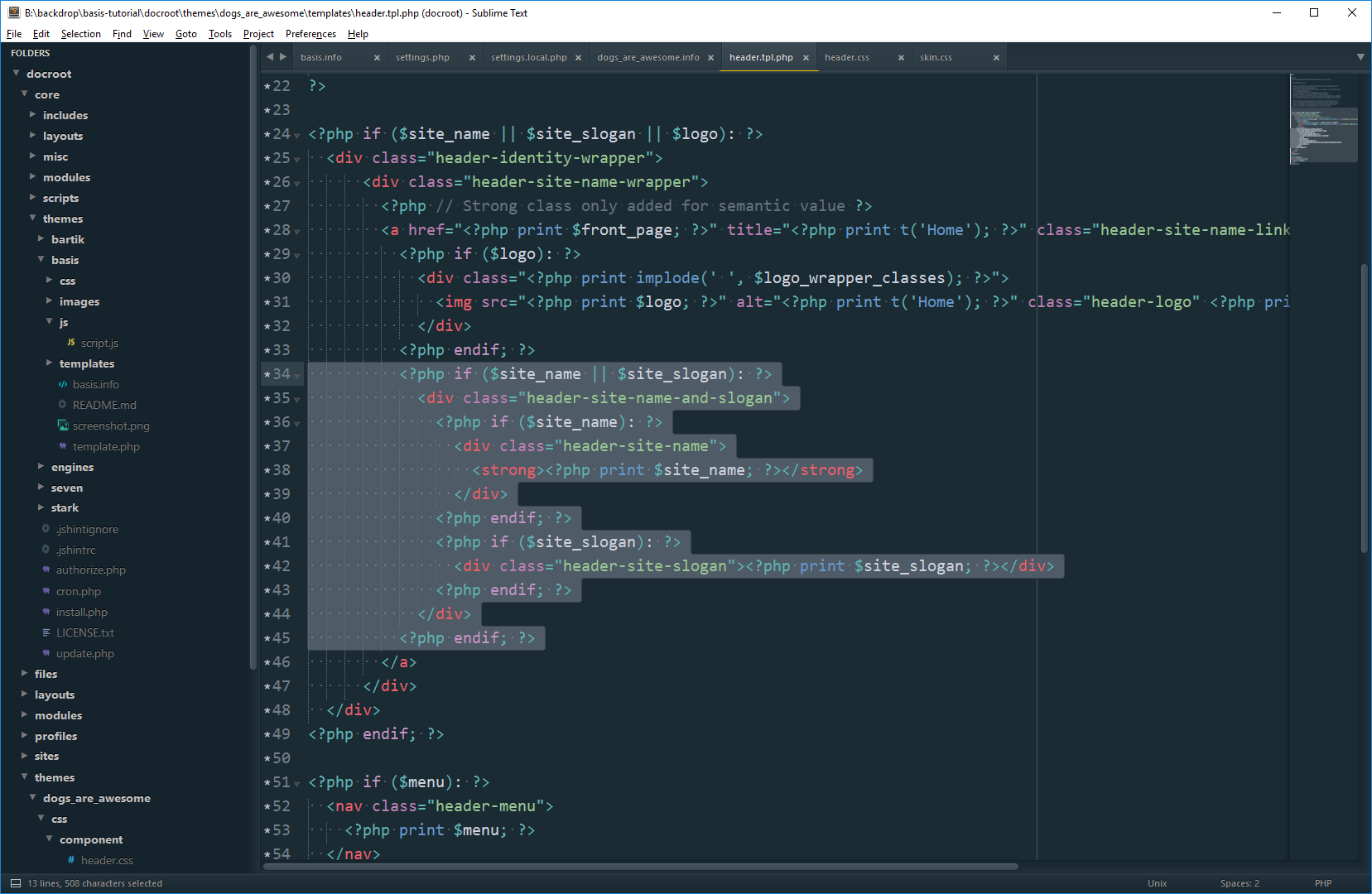
10. Overriding a template file
With few exceptions, any change to markup needs to be done in a template file. We’ll need to override the template that controls this markup.
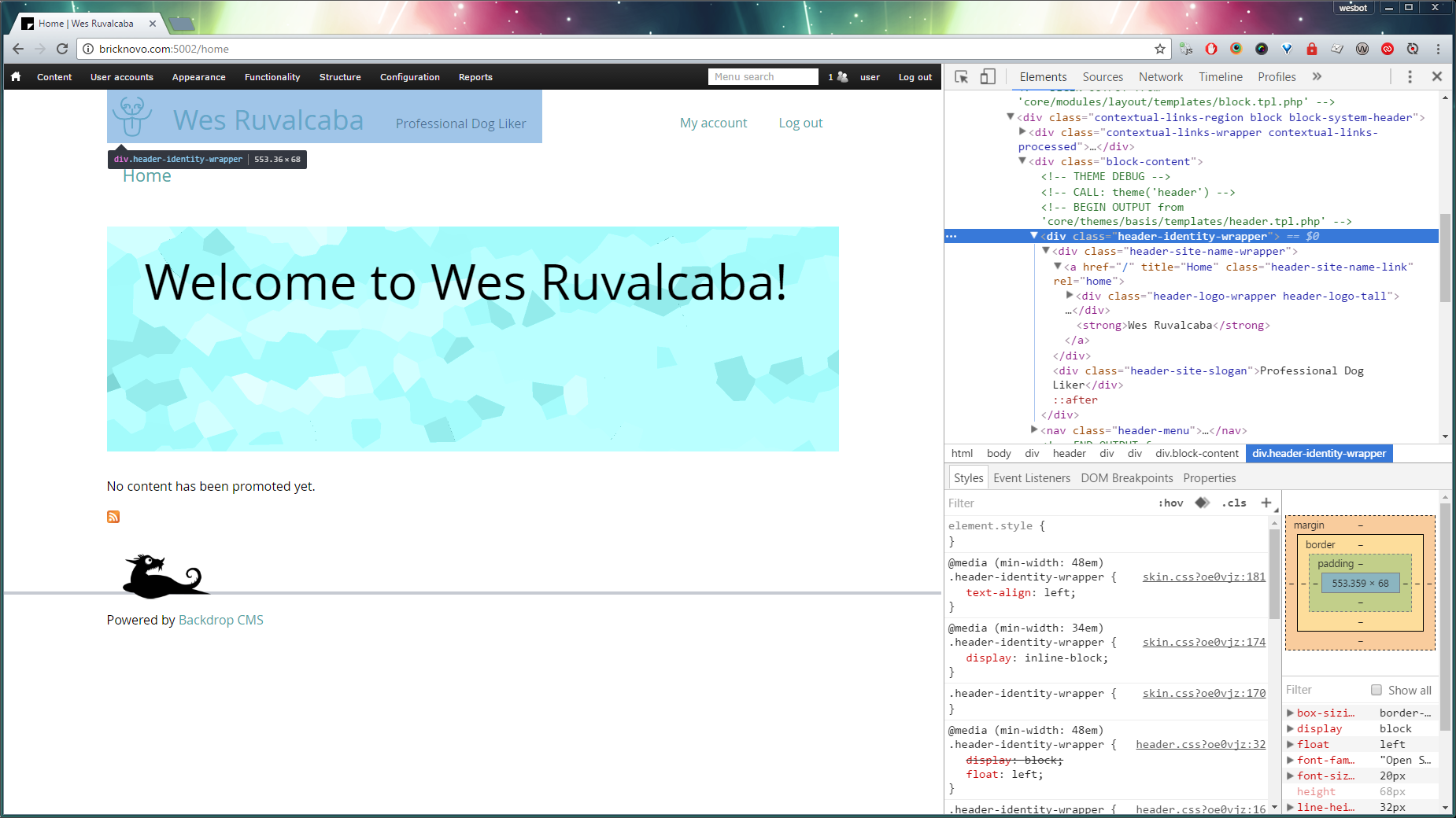
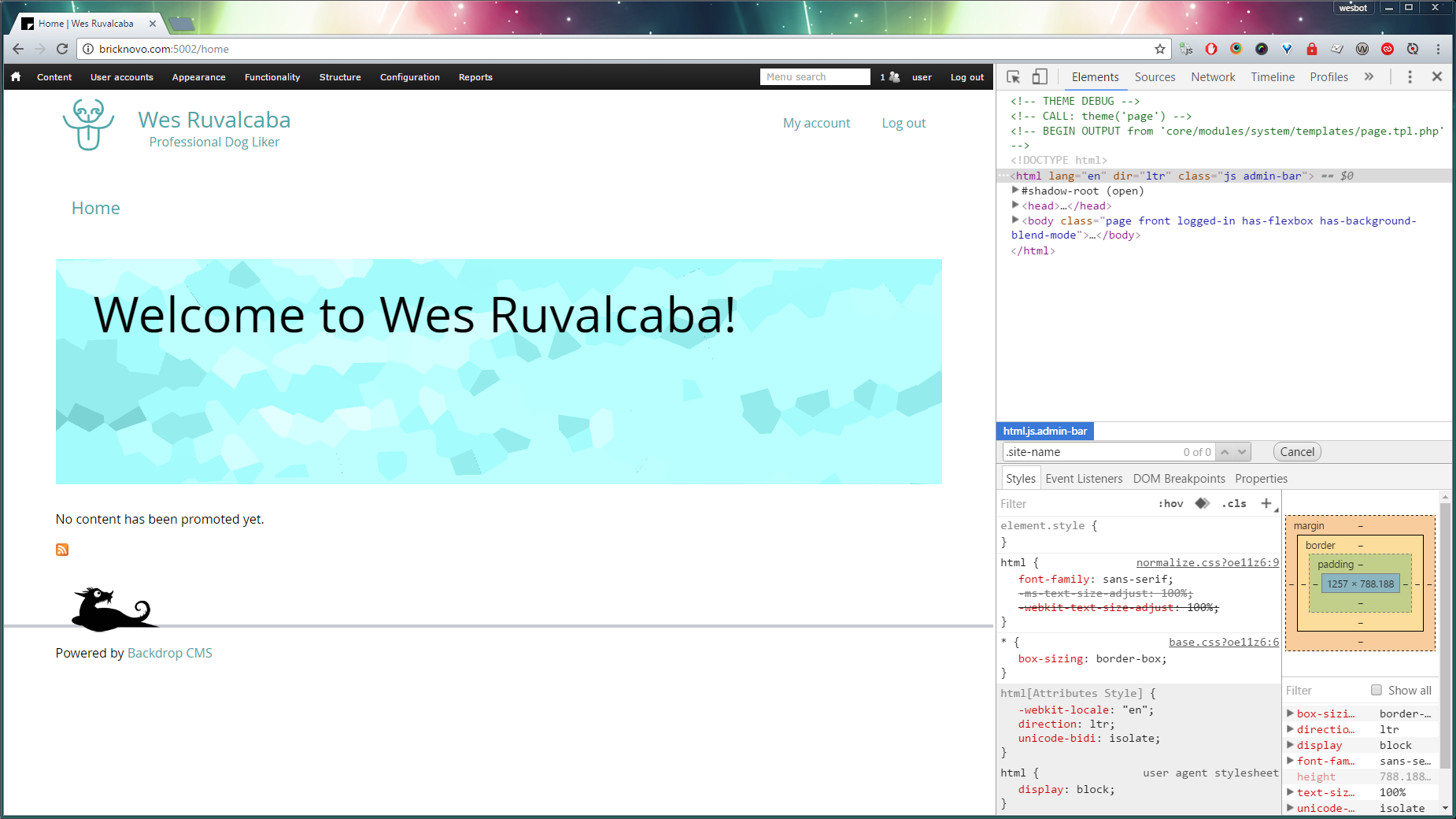
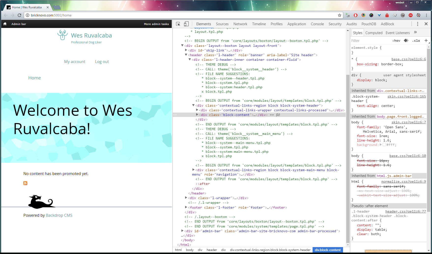
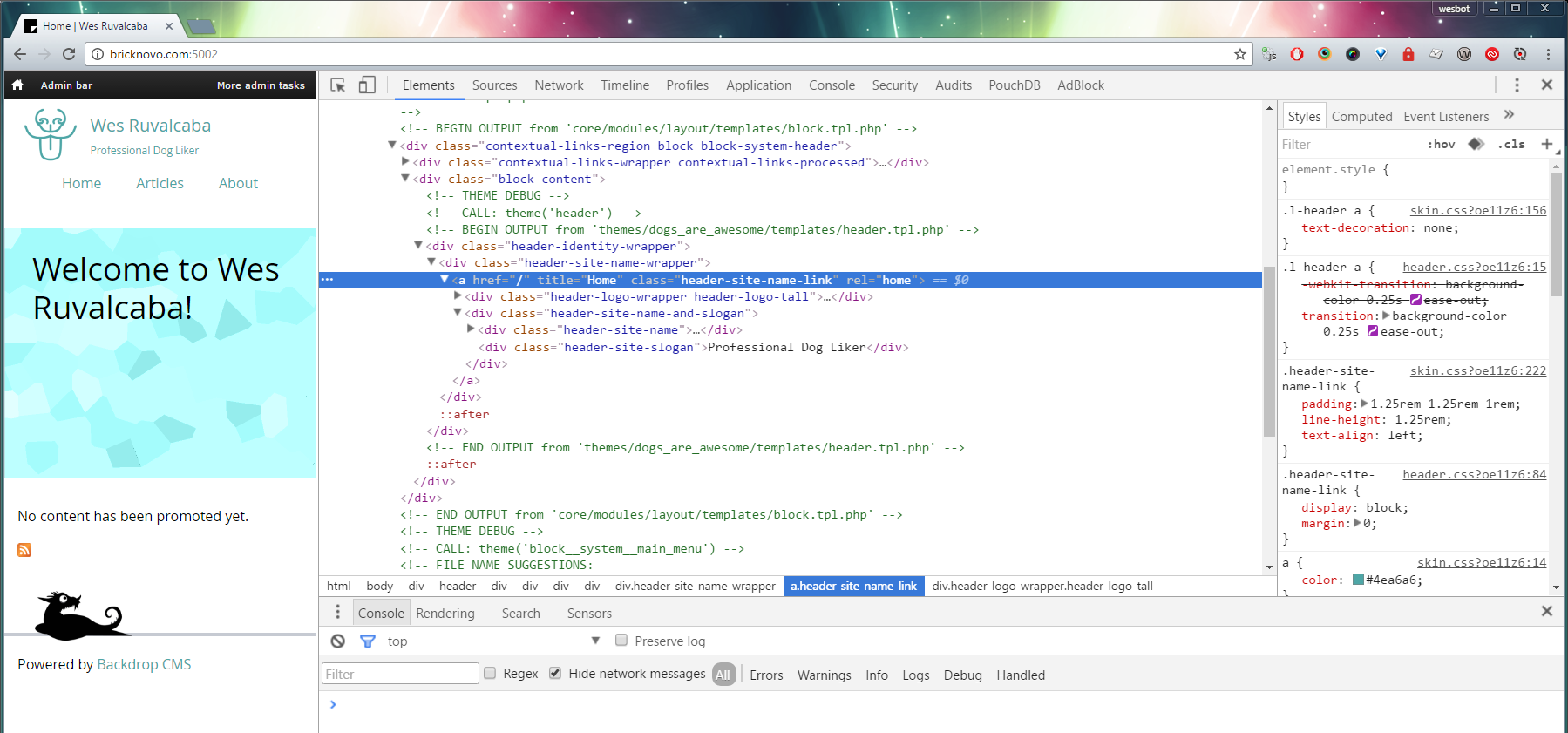
Since we enabled theme_debug (see beginning of article), it should be very easy to tell where this markup is coming from!
Inspecting the .header-identity-wrapper we can see some surrounding HTML comments. They describe the theme hook that was used, sometimes the template suggestions (though not in this case), and the actual file that got used!
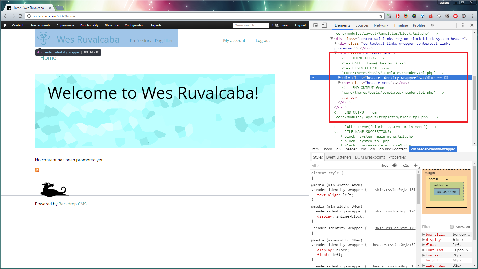
It says it’s using core/themes/basis/templates/header.tpl.php.
To override this file, we can start by copying the version that’s currently being used.
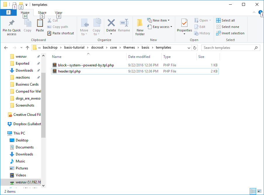
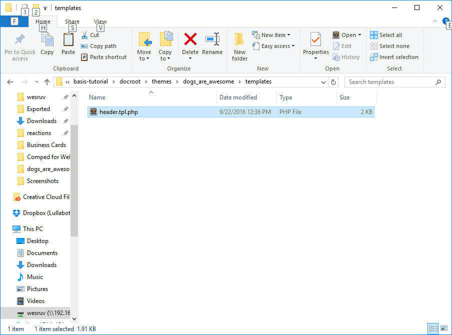
Again, I prefer to put templates in their own folder, in case we get quite a few files in our theme. But as long as it’s in the theme folder or a subfolder of it, it will get picked up.
To get Backdrop to pick up this file, all we have to do is Flush Caches! It will automatically use our file instead of the one from Basis!
Lo and behold:
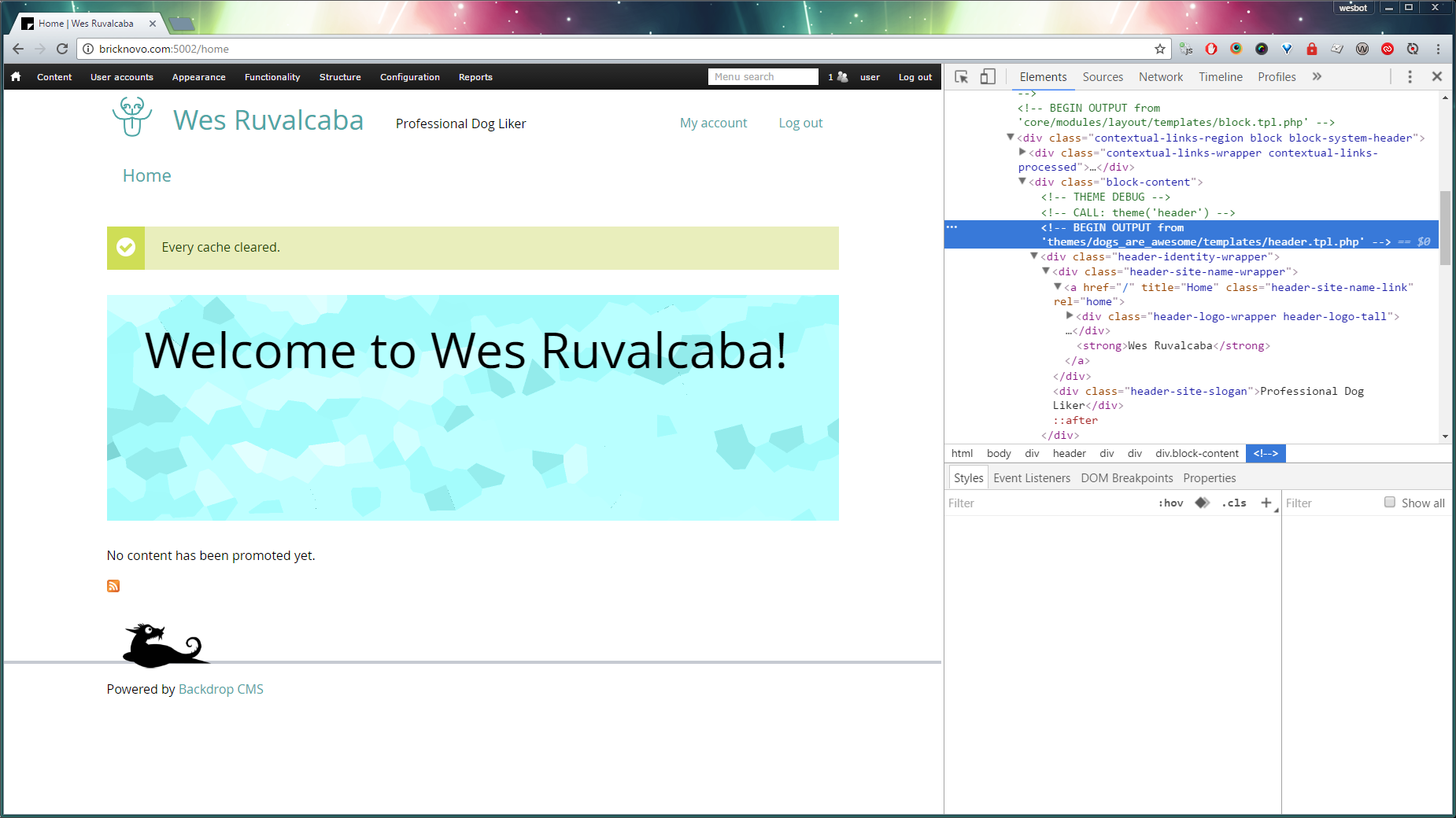
I’ve rearranged the markup, adding a div around site name, and moving site slogan (and it’s if statement), then adding a wrapper around the site name and slogan.
It looks really dumb right now, we’ll need to rework styles.
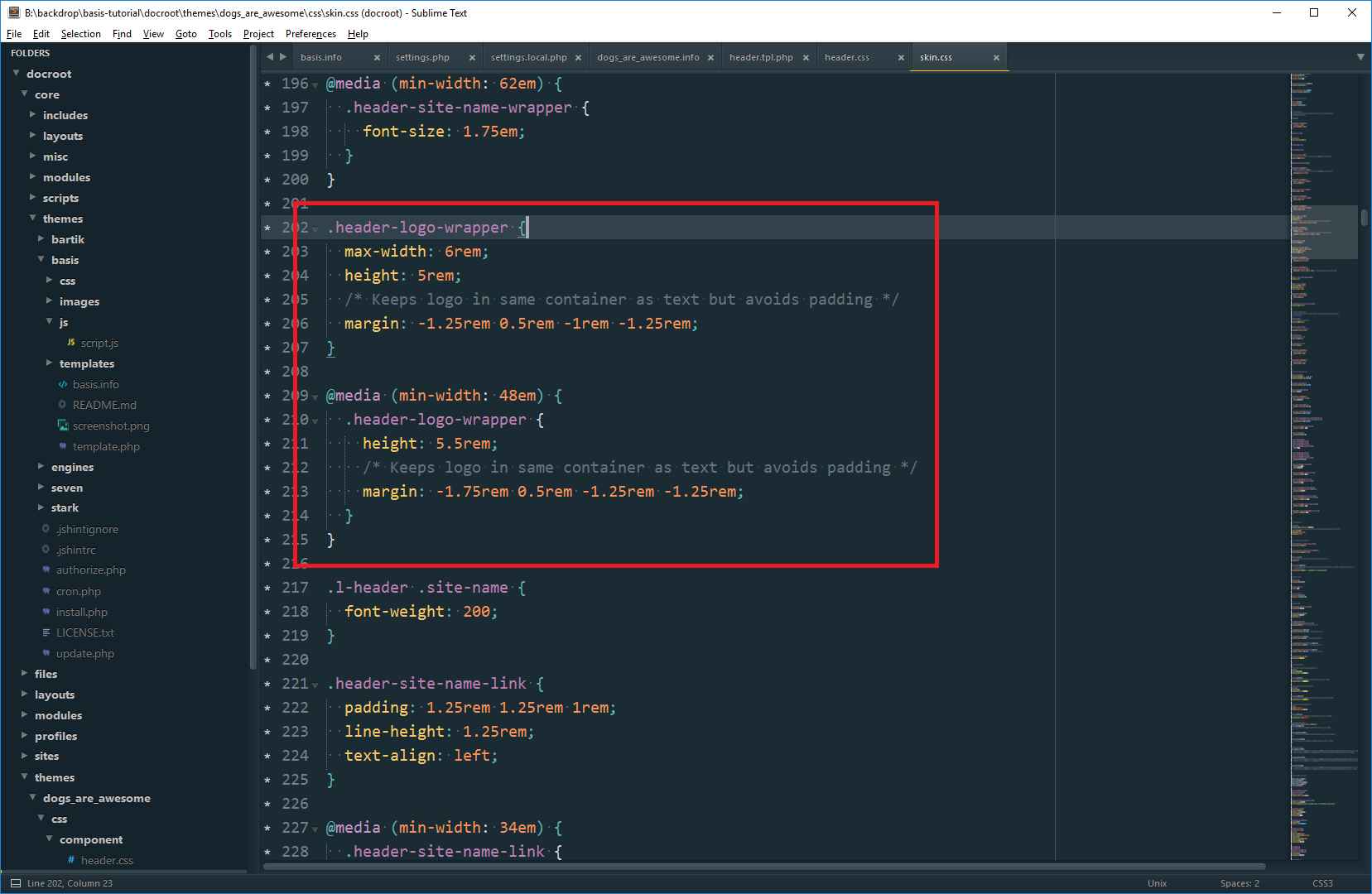
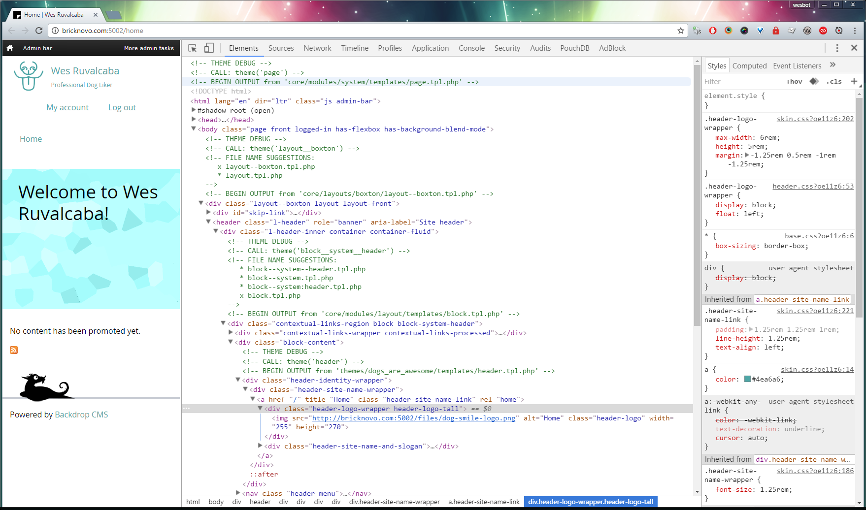
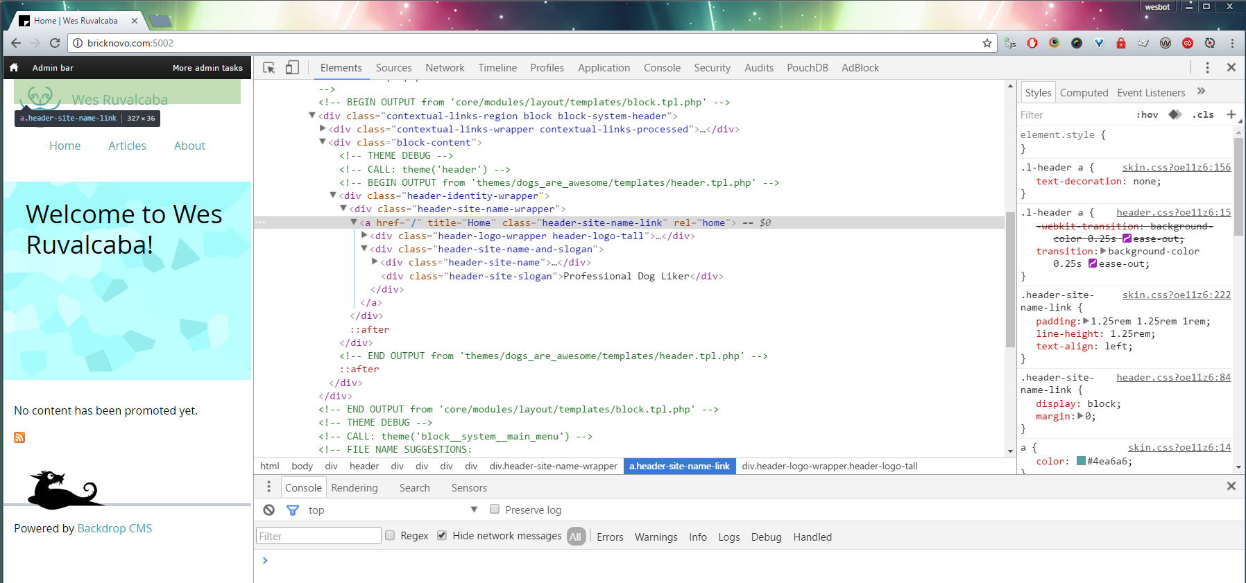
Inspecting the site logo, we can see that there’s a height set on the image’s wrapper. This is what’s determining the logo’s size.
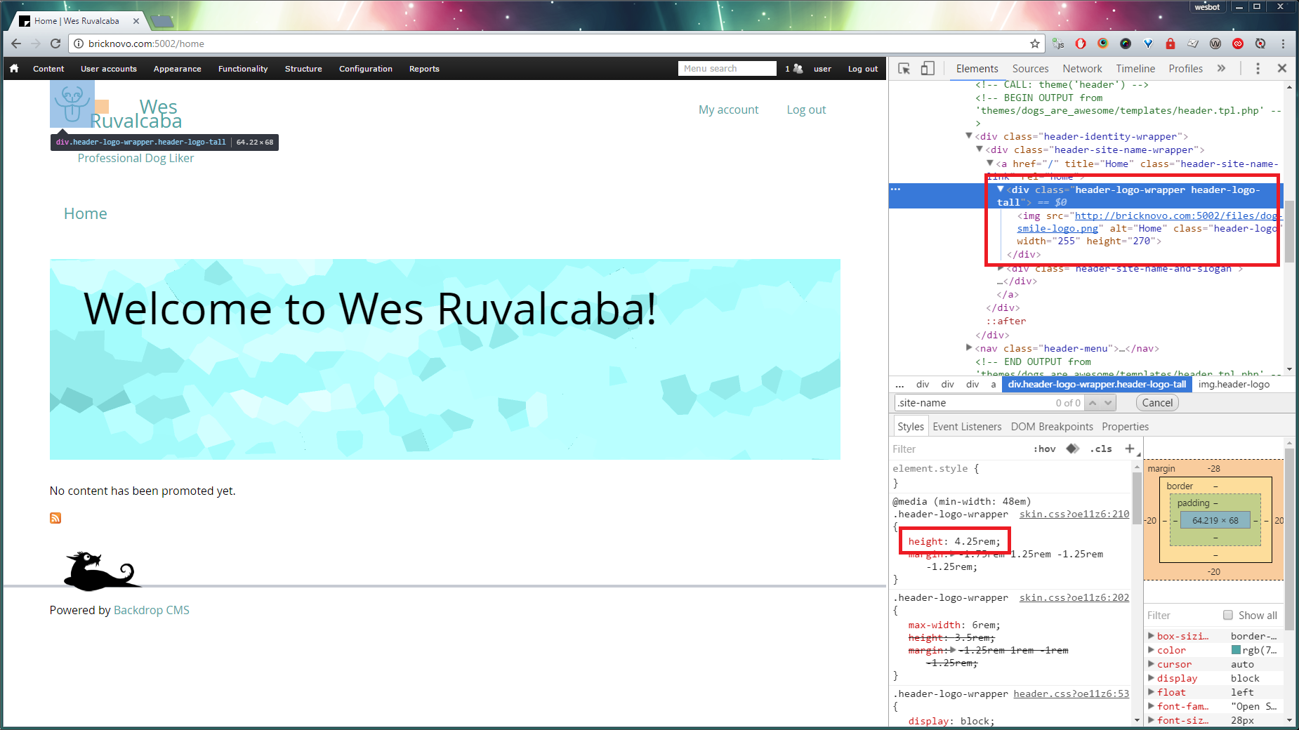
Clicking on the value of the height property, we can actually live edit the value, to see how adjustments might look.
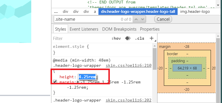
I found that 5.5rem worked best for what I wanted to see, so I made the modification in my editor, and saved.
Next I wanted to get the site name and slogan laying out correctly. There was a bit of deleting and reworking that had to happen to accomplish this.
First I added a declaration block above the .header-site-slogan styles for the new element we added .header-site-name-and-slogan, and floated that whole container, so that it will attach to the side of the logo.
.header-site-name-and-slogan {
float: left;
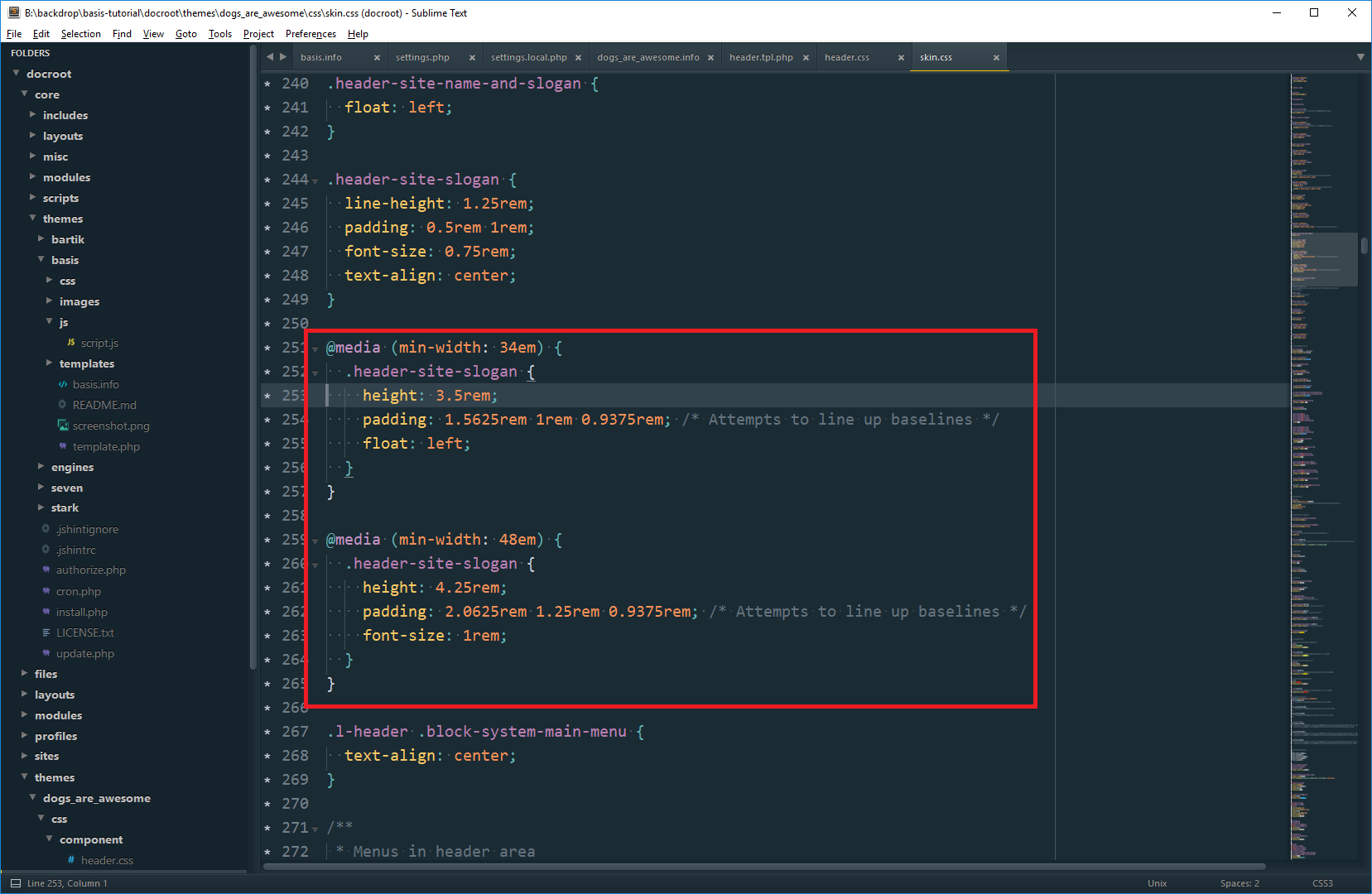
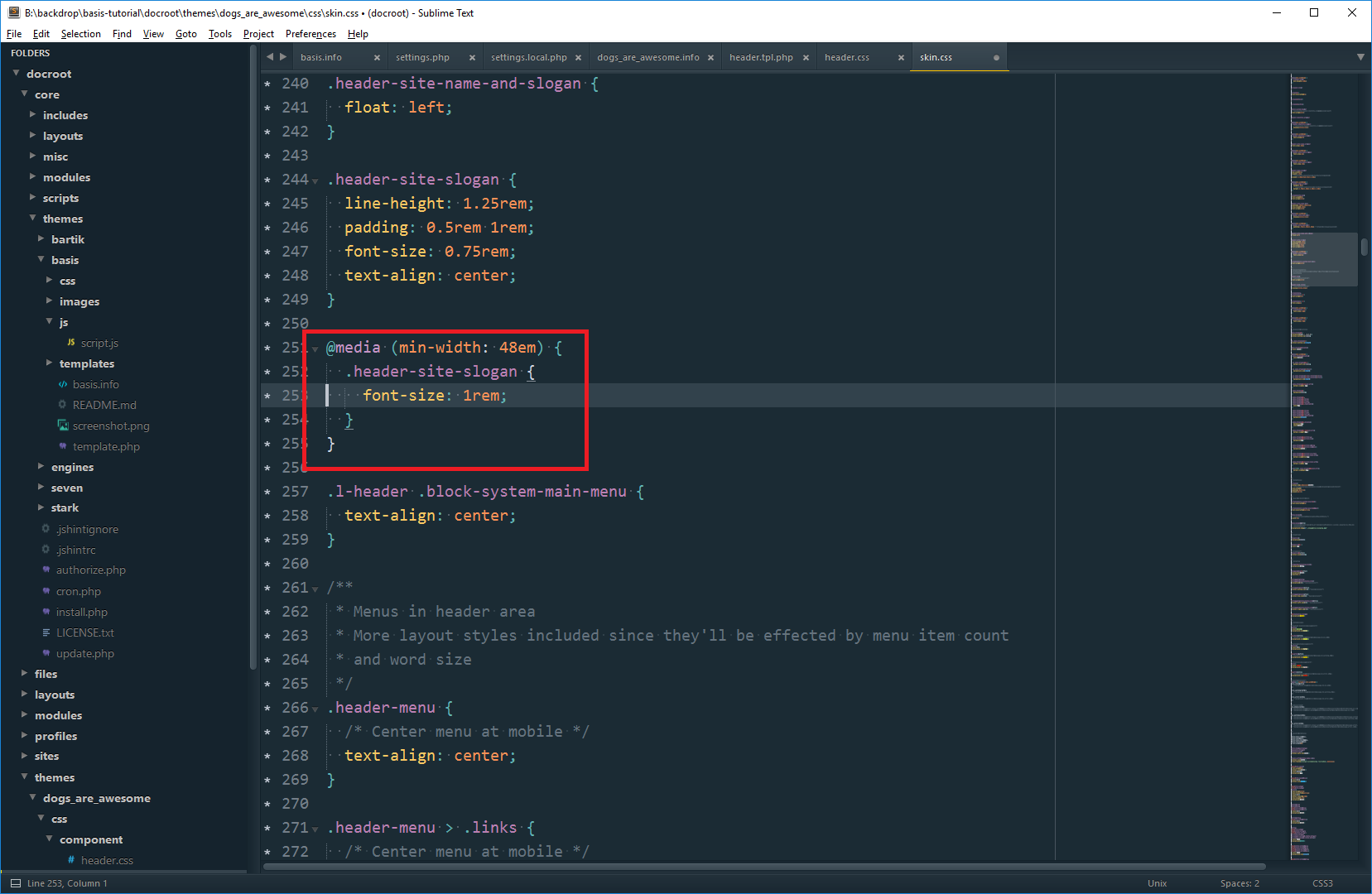
}Then we need to get rid of the layout that’s being done on the .header-site-slogan. You’ll notice that it’s getting a float , height and padding at min-width: 34em and 48em. We don’t want any of that, since the slogan will be going underneath - not to the side of the site name. The only style I’m leaving is the font-size on min-width: 48em, which I might want change later if we don’t like how it looks.
That’s a lot closer:
Now I need to fix the text alignment, which is currently centered, and remove the horizontal padding on the slogan. After that, I decided to cut down on the right margin on the logo.
Wundebar.
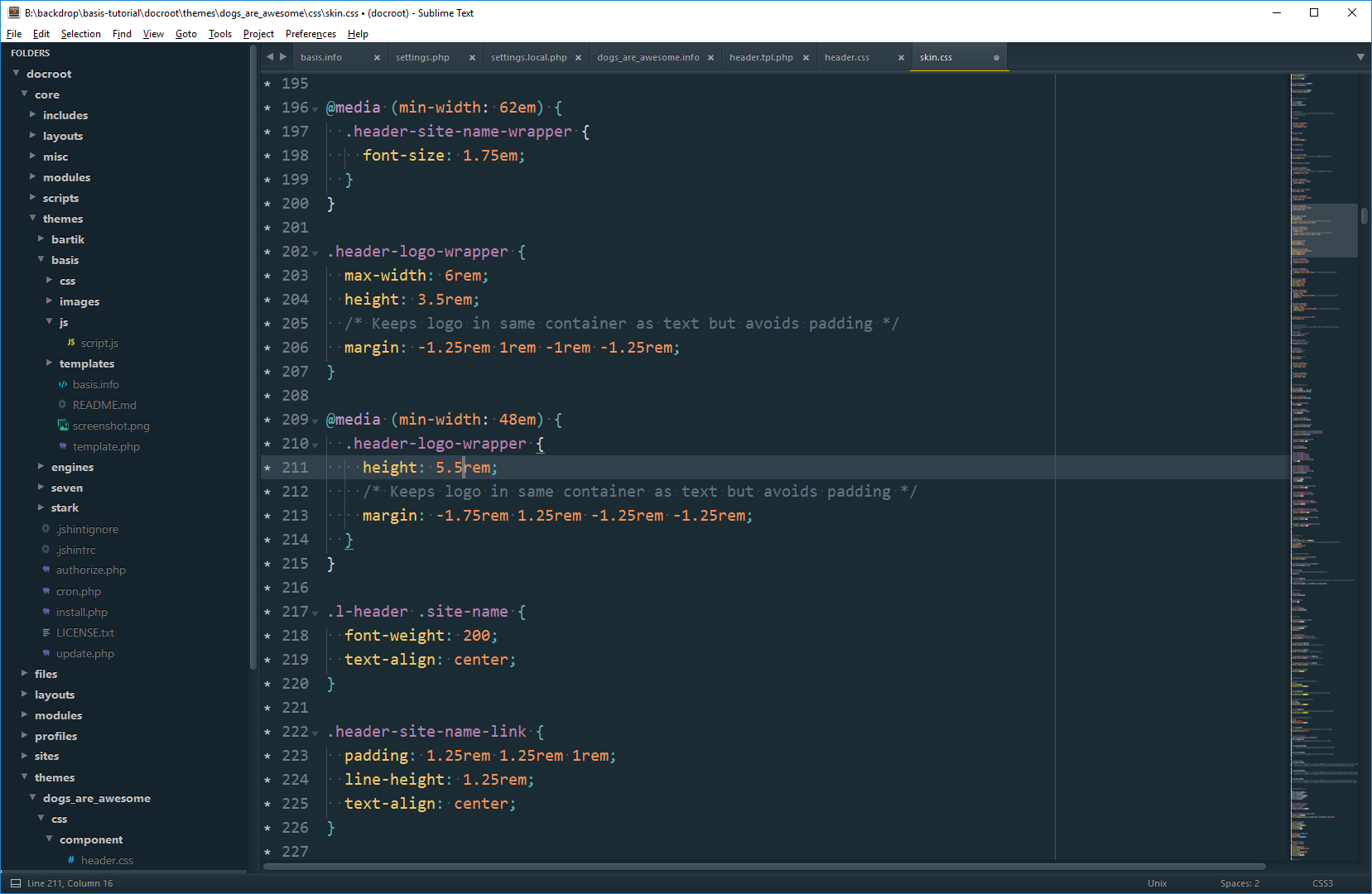
We’ve got it looking good on one breakpoint, it’s best to make sure it works on all before you move on. When I was checking that, I found that the logo gets a little too small at tablet sizes.
Checking the styles, I had only changed the block that applies at min-width: 48em when I changed the logo height.
Messing around with it in the inspector, I found I want the logo to be 5em tall below 48 em.
wOOt!
Removing the Account menu is configuration. Hover over the account menu area, a gear should appear. Then press Configure block.
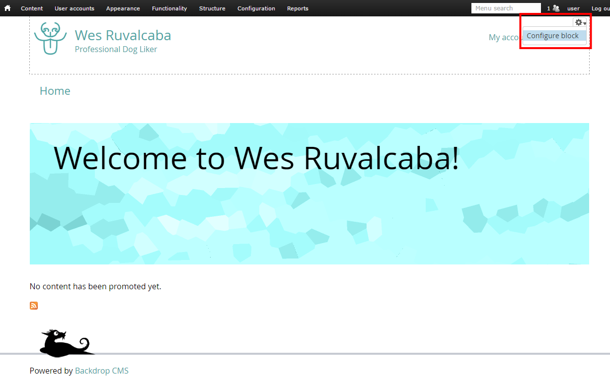
That will take you to the Block configuration. Change the Menu setting from “Account” to “None”.
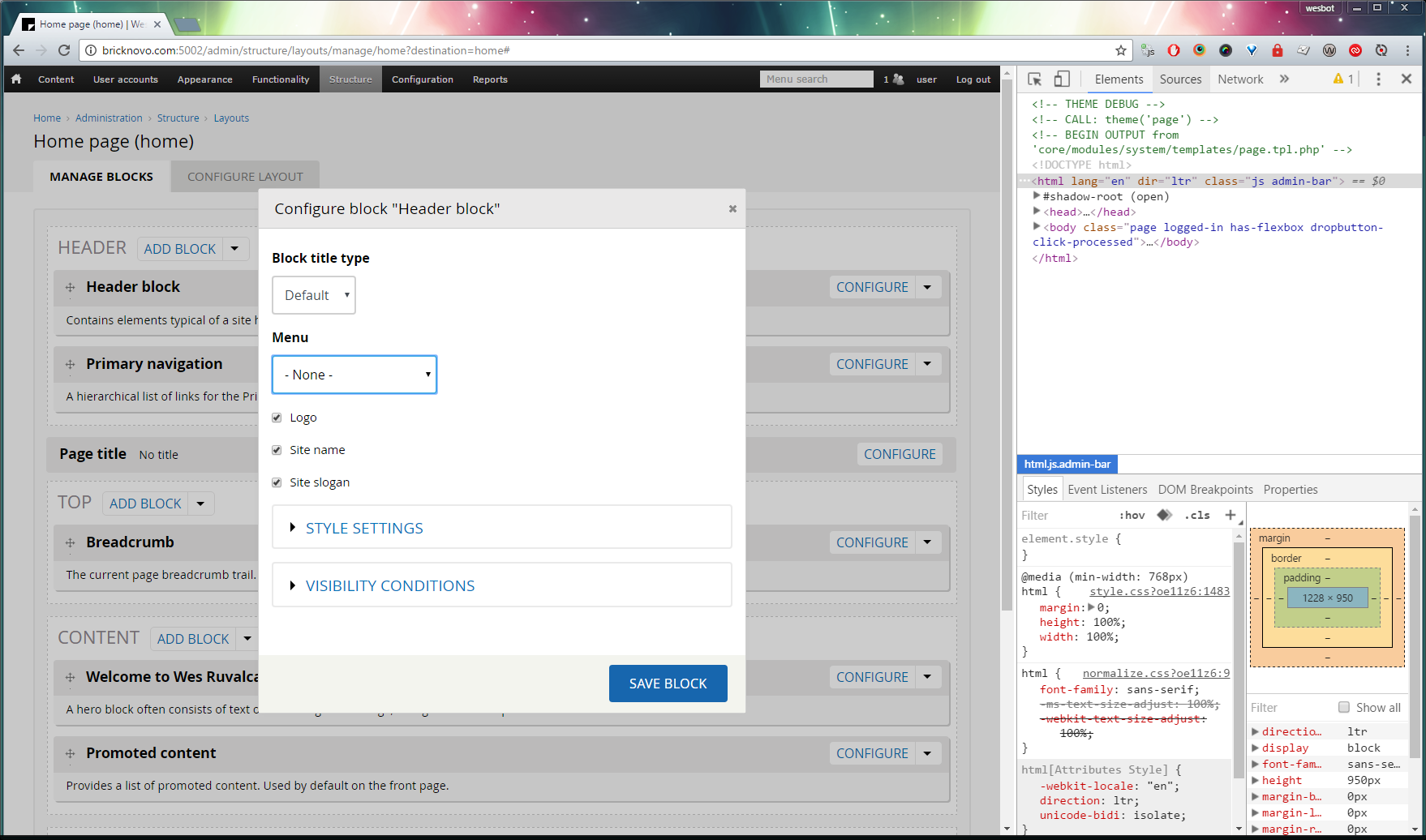
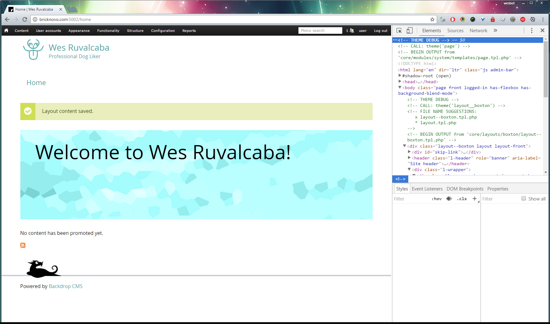
Then press Save Block, then Save Layout, this should take you back to the page you were on.
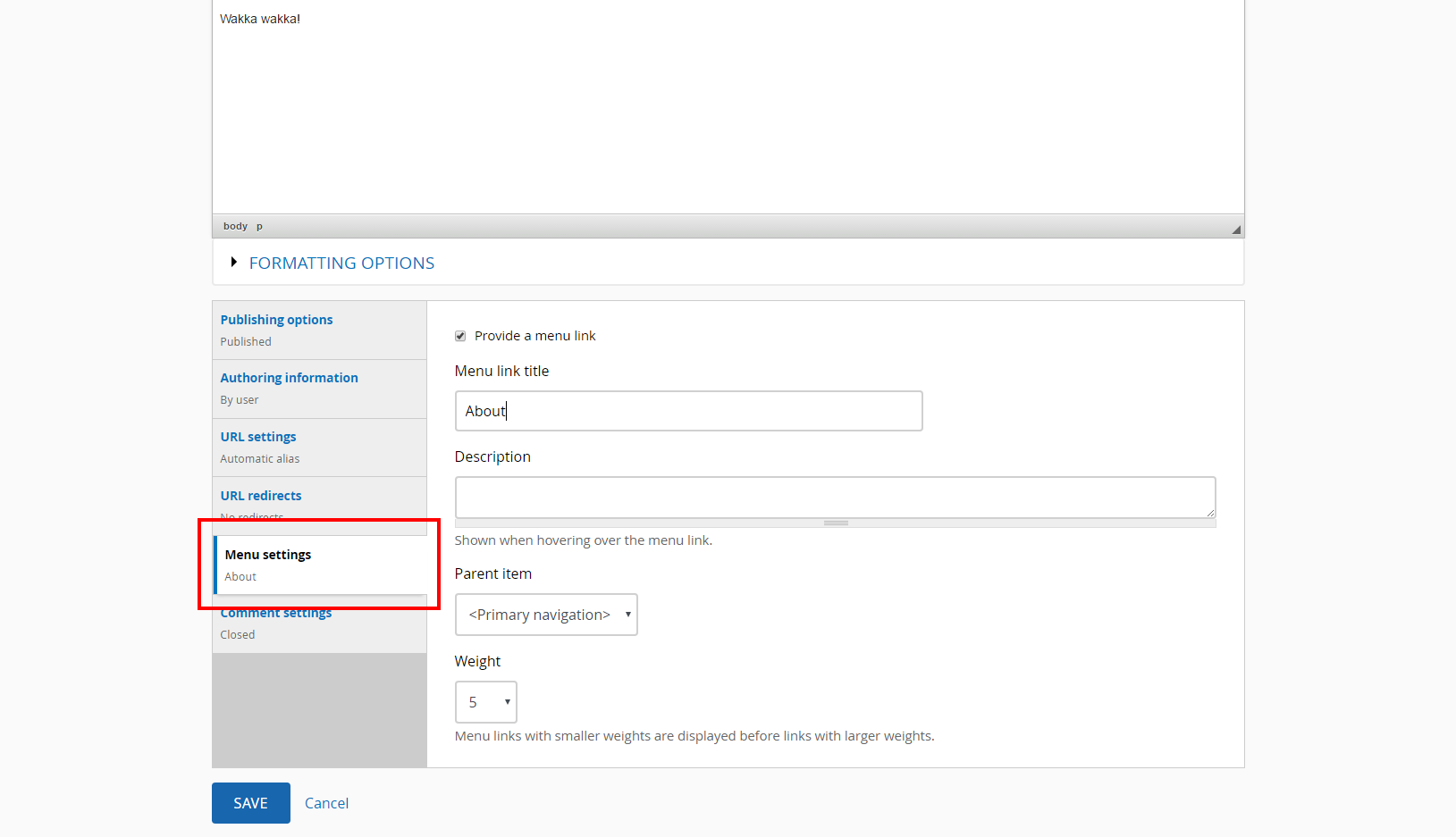
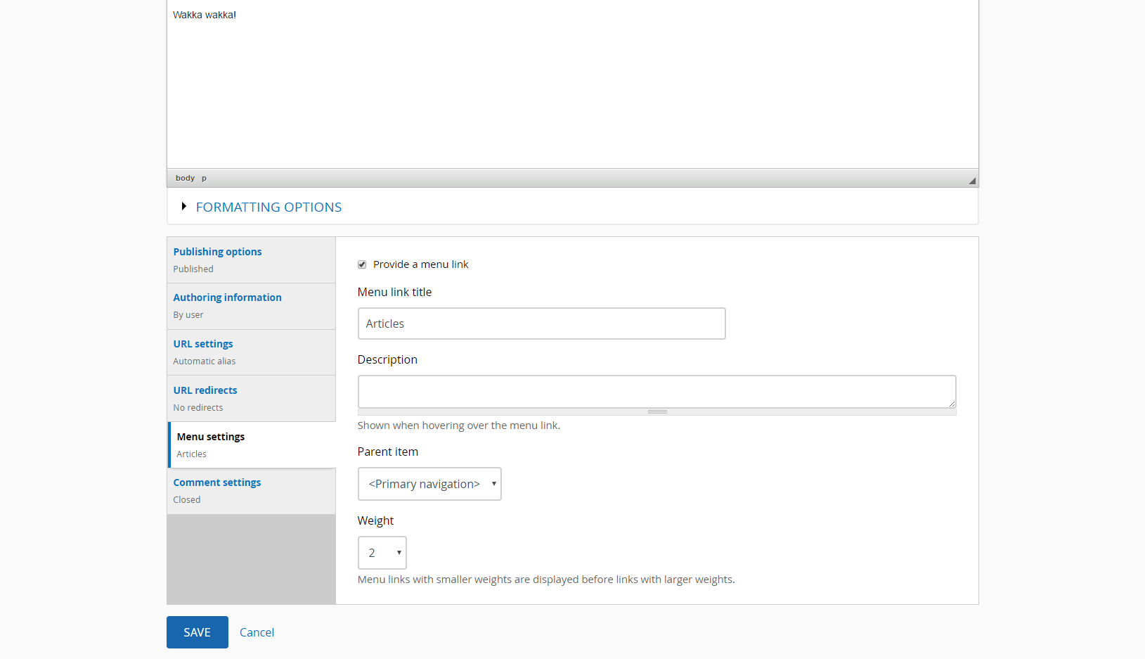
11. Adding pages
Going to add a few pages so our menu is filled out a little more. Adding an About and an Articles page.
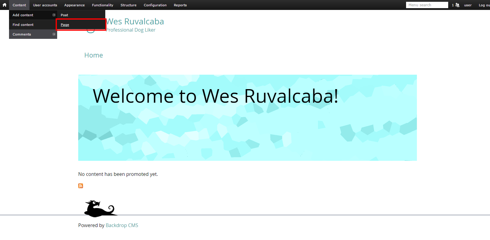
Add the 'About' page:
Add the 'Articles' page:
Resulting in:

Voila!
12. Overriding Component CSS
You may have noticed the /basis/css/component folder, the intention was to split up the CSS into different files, so they would be easier to override. Because they are split up into so many files, it is highly recommended to enable CSS aggregation on production, it is enabled by default.
There are two ways to override component CSS:
- Add more CSS styles to a file already included in the theme (like
skin.css). This is fine if there are only a few small tweaks, but this is adding more download for the end users. The more CSS that’s needed to update the styles, the more likely the second method is a better option. - Override the CSS using Backdrop’s
.infofile. This method uses Backdrop to actually prevent the upstream file from being loaded, and replaces it with your file! This is a little more effort, but it means less CSS to compete with when trying to write new styles; which is going to make for easier maintainability.
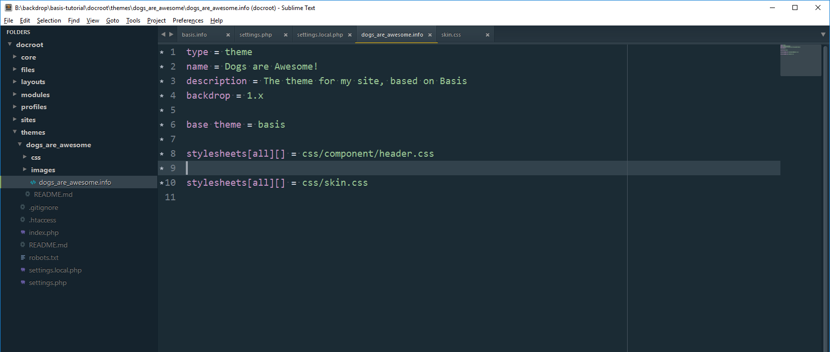
We’ve already used the override functionality from method #2, to override skin.css, so we’ll follow the same process to override header.css:
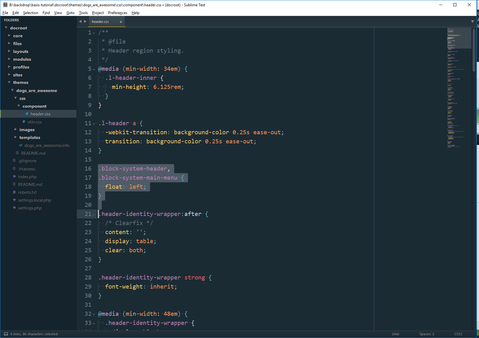
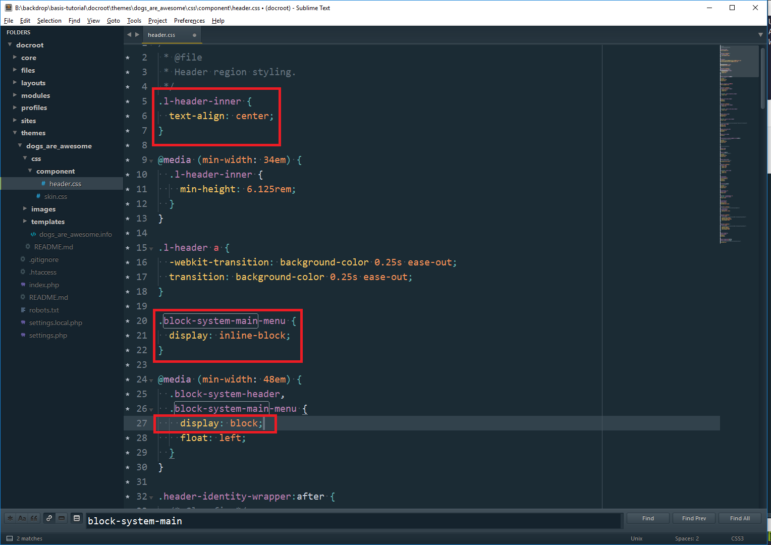
Copy core/themes/basis/css/component/header.css into your theme (I recommend adding it to a css/component/ directory for consistency.

Add it to our .info file, it’s recommended to keep the files in the same order that they are in basis.info file. Changing the order could result in some undesired issues.
Flush caches, since we’ve made a change to a .info file.
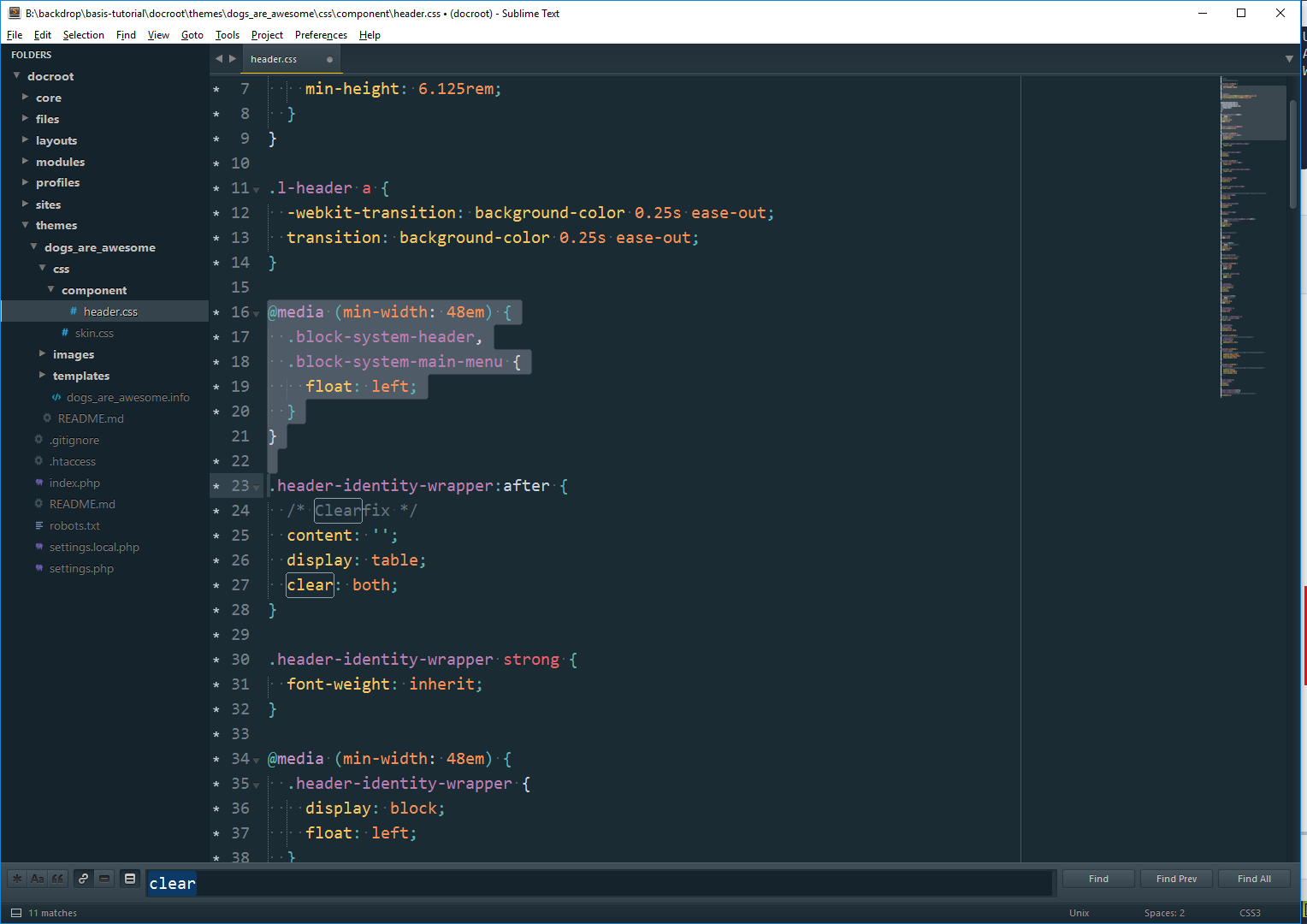
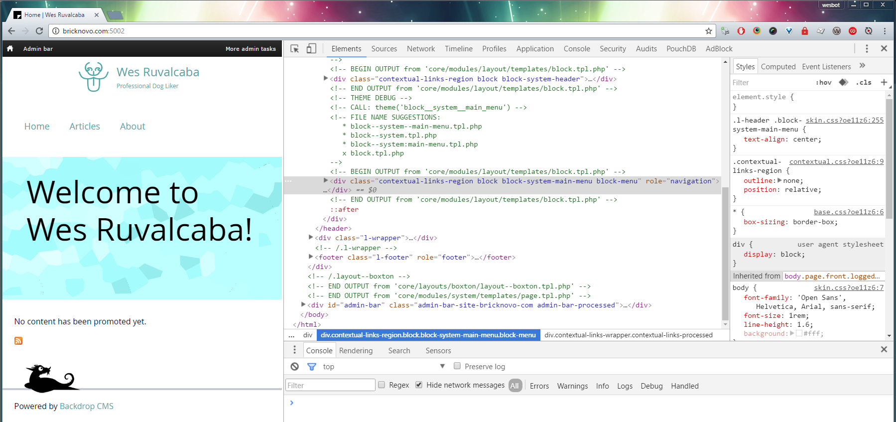
Looking at the markup, the biggest change I want to make is floating .block-system-header and .block-system-main-menu left so they’re next to each other.
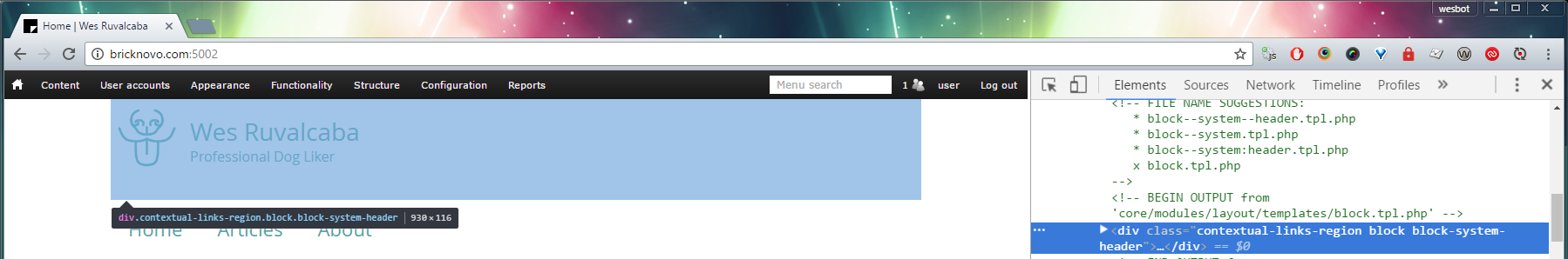
After doing that, I notice that it’s still not stacking from the left. After inspecting .block-system-main-menu, I see that it’s set to clear: both, which will prevent it from stacking next to .block-system-header.
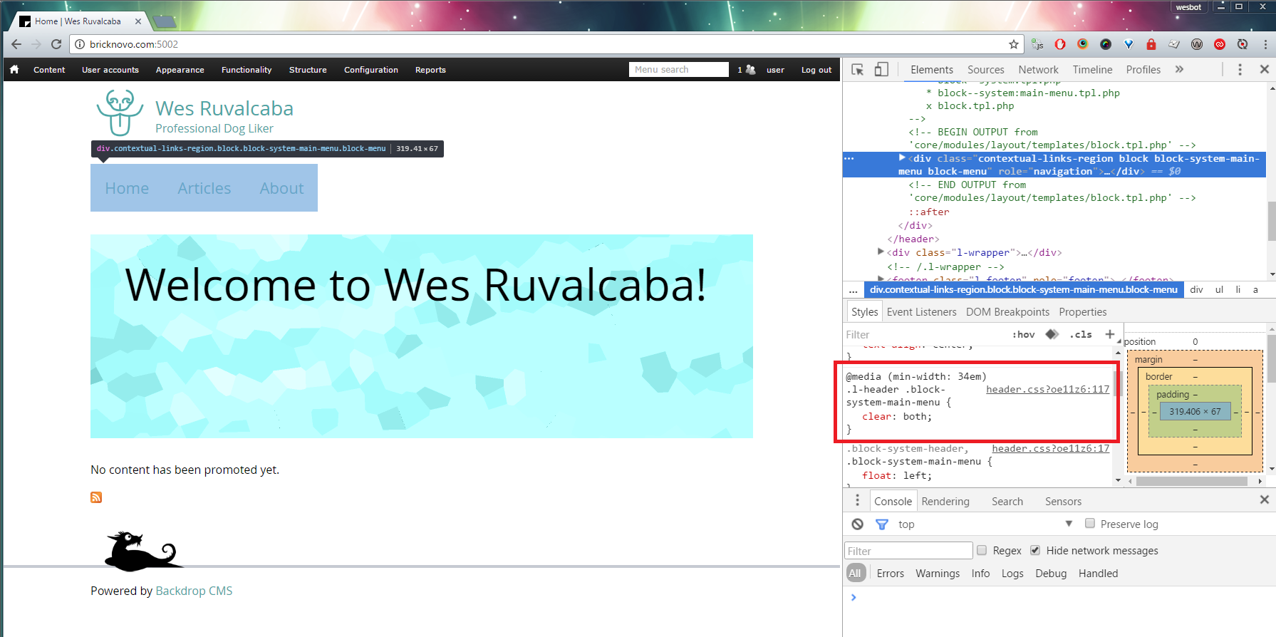
Remove that line from header.css and voila!
13. Smaller Screens
Before we get too far, I might also want to check how this lays out on smaller screen sizes.
I’m not too happy with that, I think I’ll center my site name and menu when they can’t fit on the same line.
When you resize the browser with dev tools open in Chrome, it will show you how wide the screen is:
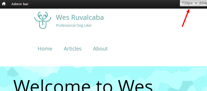
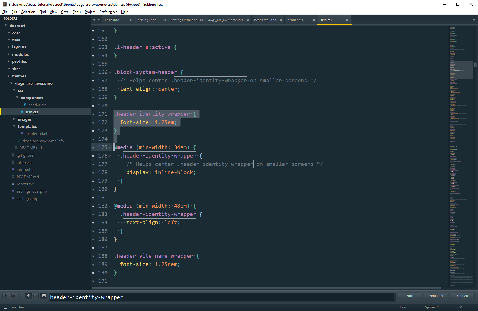
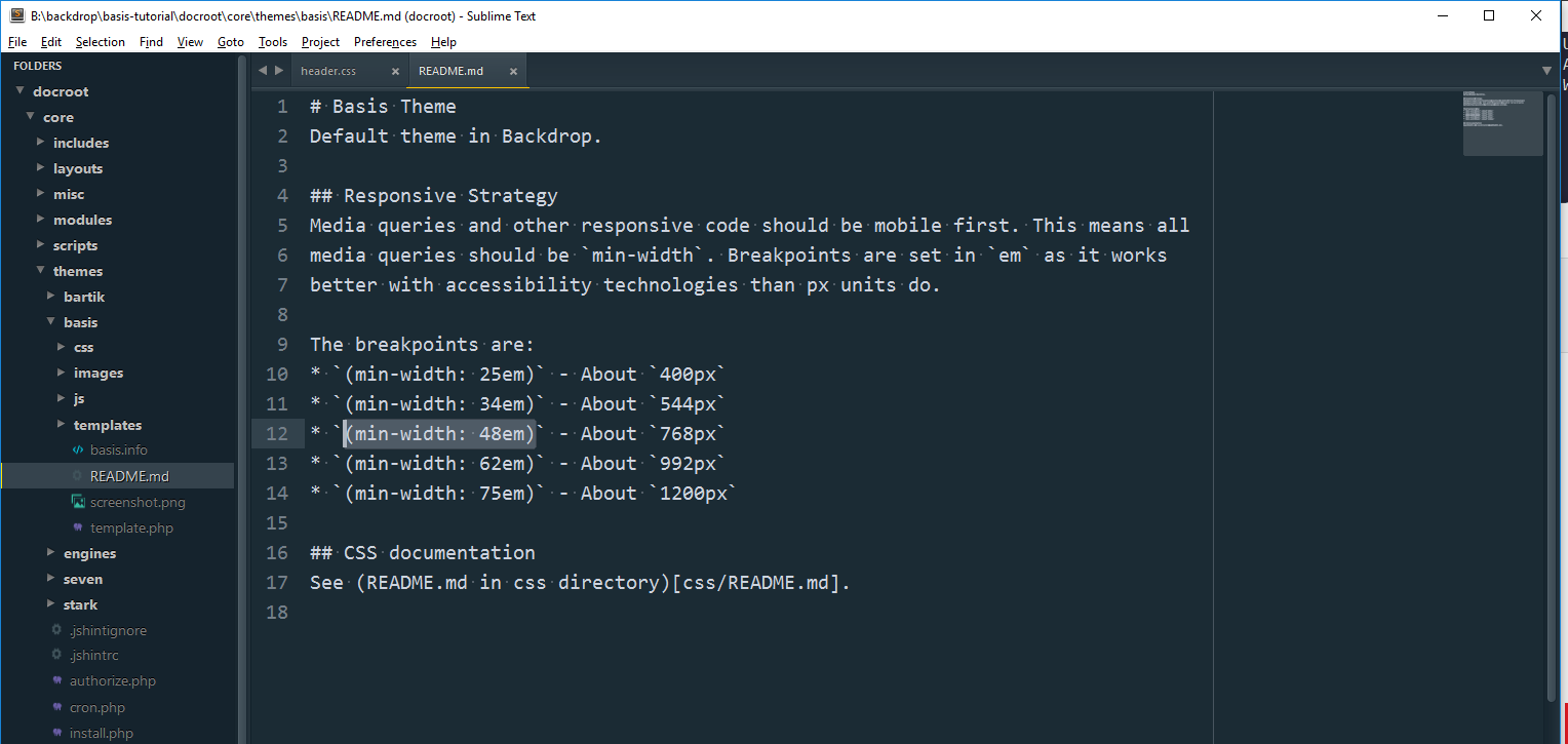
It looks like after 768px the menu can’t fit on the same line as the logo. If you see core/themes/basis/README.md*, you’ll find documentation for the existing breakpoints in the Basis theme. Generally it’s good to stick with those, it looks nicer when breakpoint styles line up at the same point.
* Documentation added in this issue: https://github.com/backdrop/backdrop-issues/issues/2233, will be in 1.5.1 release.
Looks like the breakpoint we want is (min-width:48em). First step is to wrap our float style in that @media query, so it only effects layouts larger than 768px.
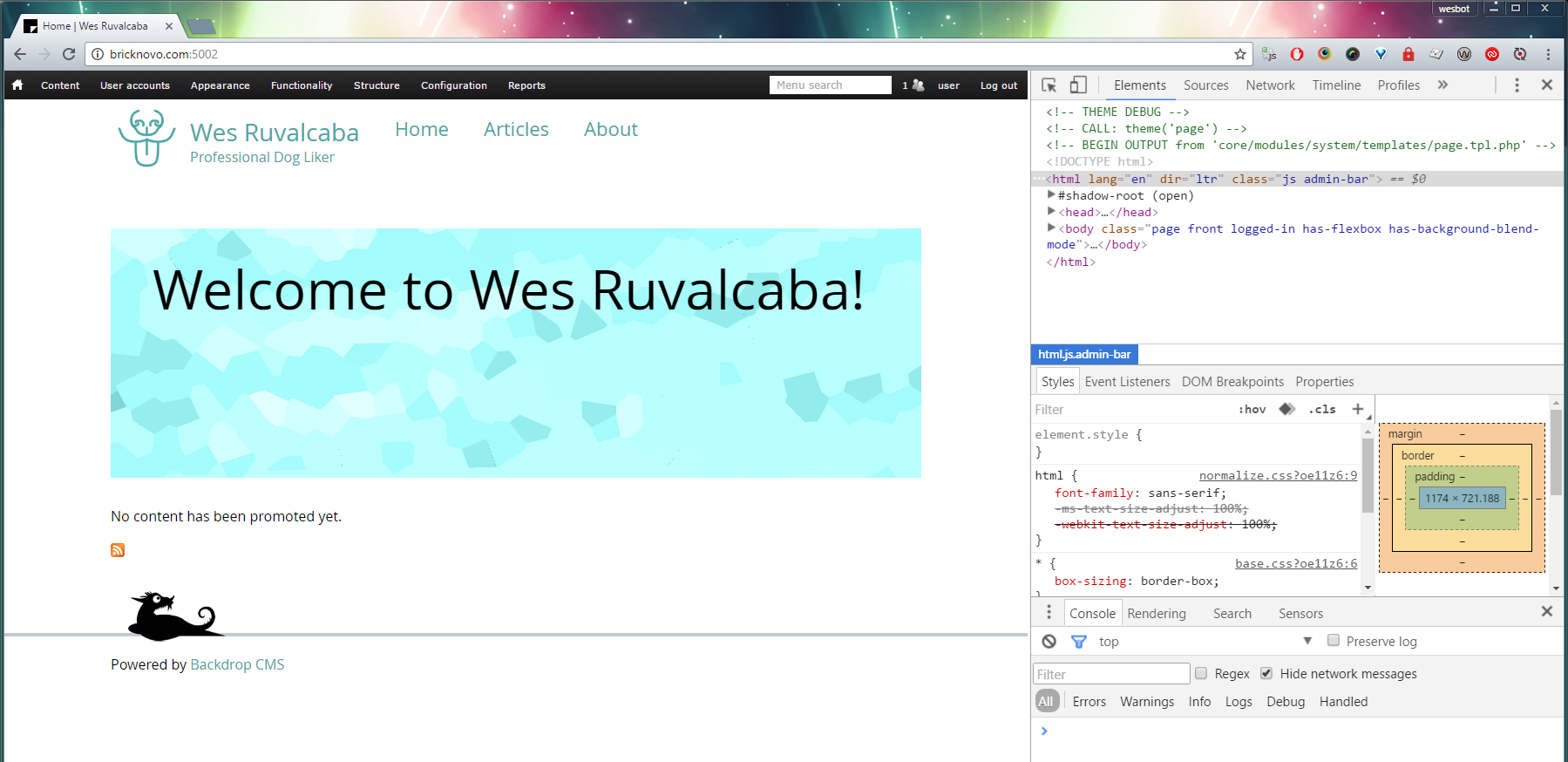
Taking a look at the theme, it looks like now it’s centering the logo for us, we just have to figure out the menu:
To do this, we have to take advantage of some strange nuances of CSS. Basically any element set to inline-block will take on the width of it’s contents, and it will also respect text alignment.
So we’ll set the item we want to center display: inline-block and on it’s parent we’ll set text-align: center.
We’ll also want to set the centered element back to display: block if we’re no longer trying to center it.
I’m also noticing with the current design there’s too much space between my logo and menu, and then between my menu and the content.
Inspecting the elements I noticed that .header-site-slogan has padding on the bottom and the outer wrapper .header-site-name-link also has bottom padding. I don’t really need both, so I’m getting rid of the bottom padding on the .header-site-slogan.
For the distance between the menu and the content, that looks like it’s coming from layout.css, which is adding 2em of bottom margin. Instead of overriding that whole file, I’m going cheat a little, and override that style in skin.css with a margin bottom of 1em.
Now let’s check an even smaller screen:
Our logo got left aligned, and our menu is too close to the logo.
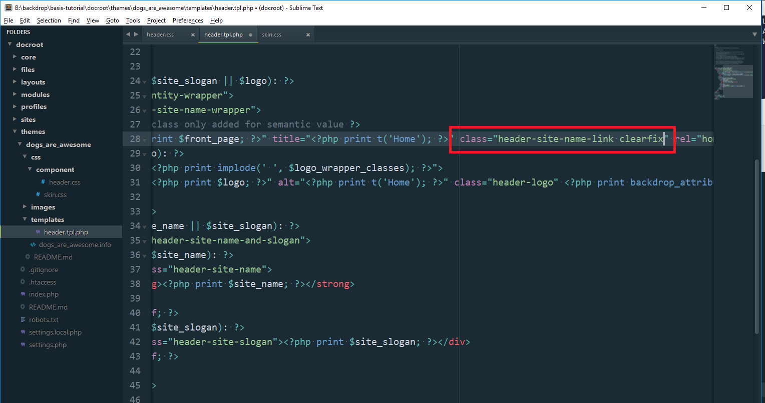
Inspecting the document, I found .header-site-name-link isn’t as tall as it should be. 😞
This was a bug that got introduced when we floated everything inside of the .header-site-name-link. In CSS floated items don’t effect the height of their parent elements, unless we clearfix them.
Easiest way to fix this issue is to open up header.tpl.php and add a `clearfix` class to .header-site-name-link.
To center our logo even at mobile, we can simply change the .header-site-name-link to always be inline-block.
Voila!
Lastly, we want to make sure that none of our mobile styles interfered with any desktop styles, so I rechecked the medium and wide breakpoints, to make sure they’re still working as intended.
Awesome!
14. Miscellaneous Tips
a) Make sure there aren’t hidden unthemed elements
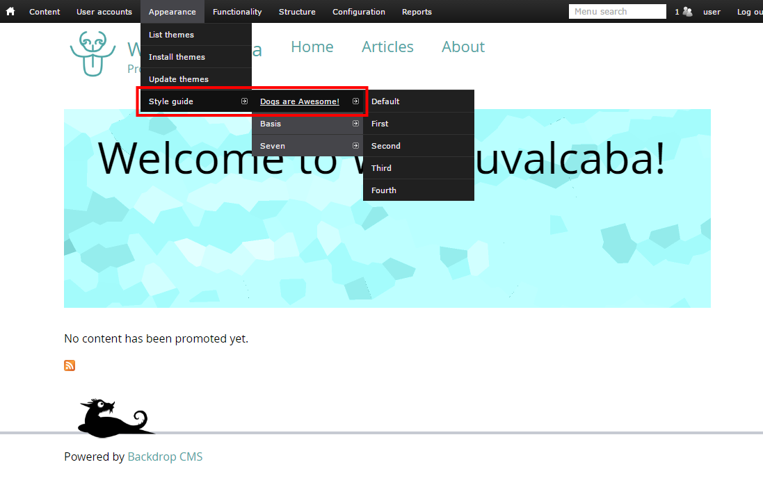
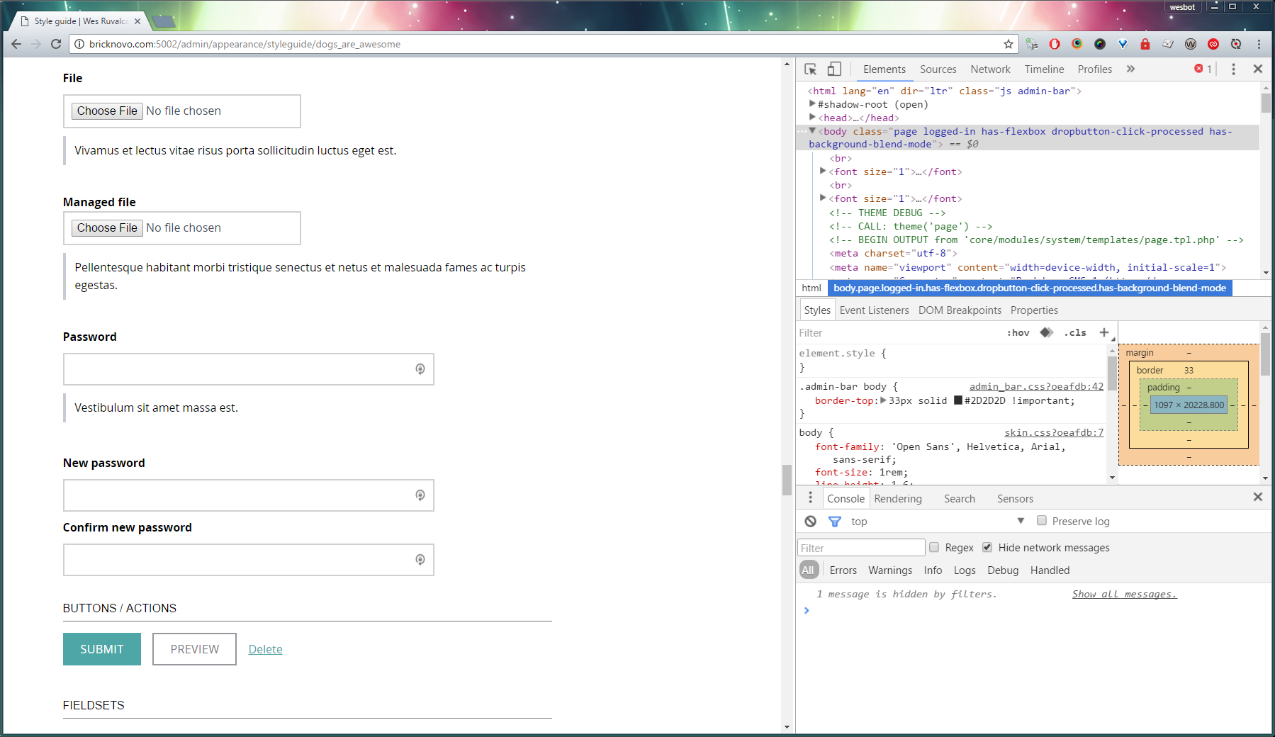
I didn’t override much in skin.css, but it’s likely that you’ll want to spend more time on that than I did. I recommend installing the Styleguide module to make sure you’ve skinned everything that might come out of Backdrop.
It’ll add a new item under Appearance. Click on your theme’s name, and it’ll give you a page that shows all of the default elements from Backdrop.
b) Make sure you check state styles
Check, hover, disabled, active, focus, etc for interactive elements like links, form elements, buttons, etc.