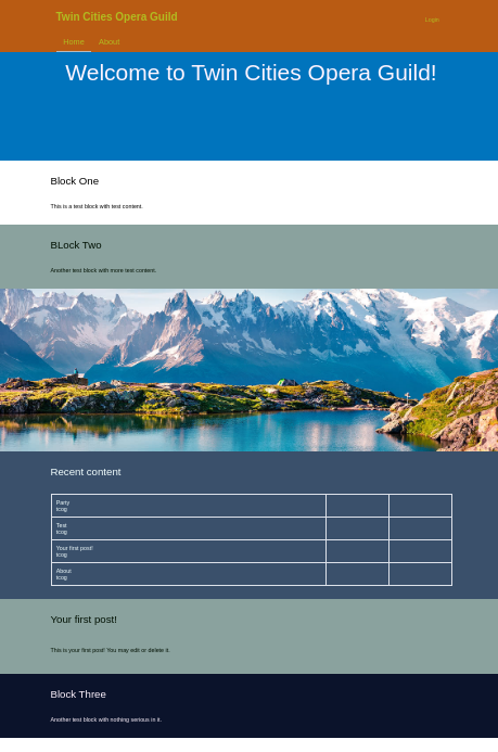
The Opera theme was inspired by work that Triplo did for the Twin Cities Opera Guild with a design
by John Seymour Anderson of Triangle Park Creative. Certain elements of that design were carried
over into this contrib theme. Most importantly, a stacked design of full width panels with
background colors.
See Opera in action: https://themeswitcher.simplo.site/
Here are some Simplo sites that are using Opera. None of these have been subthemed, but they are
using contributed modules and custom configuation to acheive some special effects.
Status
We just released an beta version of this theme as we are moving closer to a stable release in the
near future. We still need more folks to test it out and provide feedback and file bug reports. In
the beta stage we may still make changes that could effect end users. If you use an alpha or beta version
on a production site, you may not be able to upgrade without noticing some small (or even large)
changes on your site.
Once we issue a stabile release, we will avoid any breaking changes within minor releases. At that
stage, all changes in minor releases will be backward compatible.
Most recent release includes fixes to make it work better with the new Cards content type in default
Backdrop installations and the new Welcome Recipe released by Simplo.
Who is this theme for?
The primary audience of this theme are individuals and organizations interested in any of the
following:
- A flexible theme that allows for significant customization
without the need for any custom css. - Anyone interested in a single page website with many stacked
panels. - (Future) Subthemers interested in inheriting any of the
previously mentioned features.
Assumptions / Design or Theming Principles
- Trying to use REM as consistently as possible (lots of work to do)
- Minimize the need for ANY custom css, while leaving the possibily or
opportunity for users to create their own sub-theme if they choose.
Recommended Modules
Some specific modules that we think will improve your experience with this theme.
Goals
- Instructions for sub-theming (future)
- Compatible with color module (done)
- Provide default CSS files in simple CSS (done)
- Provide a SASS starter kit for sub-theming (future)
- Provide a straight CSS starter kit for sub-theming (future)
Instructions
One of the primary features of the Opera theme is the ability to build a layout using full width blocks
with backgroud images and/or colors stacked one above the other. full-with layouts on the front page
with To leverage these features you will need to follow the following instructions:
- Be sure to use the Boxton layout on front page (for full width blocks with background colors)
- Any blocks placed in content region of front page will automatically get assigned background colors based upon site color scheme
- Choose from pre-defined color schemes in theme settings (or use color module to define your own)
If you use the Boxton layout for your front page. The following will be true:
- The first and last block in the content region will have a white background with black text.
- Any blocks in the content region between the first and last, will cycle through a list of three colors schemes set in the themes settings.
- Any hero blocks will start out with min-height of 450px.
Features implemented so far
Please, feel free to provide feedback on these features and/or the implementation.
- This theme has a the following template to override Boxton when it is on the front page. The layout--boxton--front.tpl.php removes the container class from the content region and header allowing blocks to spread out the full width of the screen. An override of block.tpl.php puts the container class into the title and content of any block found on the front page.
- We have provided template files for all of the core templates that move the top region above the default locaton for title and tabs. This puts the default position for breadcrumbs above the page title and tabs. We now have the possibility to make other adjustments in all core layouts.
- So far, this theme inherits a lot of it's default styling from Basis and Tatsu, but with improvements. That may change over time.
- We have added a setting to load Bootstrap CSS from CDN.
Here is a 30 minute video discussion of several members of the Backdrop CMS community talking about how to build a contrib theme like this one. https://youtu.be/BeEzXuwLxo8
Utility CSS Classes
Font Styles
- color-inverse
- font-size-xxxxlarge
- font-size-xxxlarge
- font-size-xxlarge
- font-size-xlarge
- font-size-large
- font-size-medium
- font-size-normal
- font-size-small
- font-size-xsmall
- font-weight-bold
- font-weight-normal
- font-weight-light
- font-style-italic
- font-style-normal
Background Colors
- opera-bg1-black
- opera-bg1-blue
- opera-bg1-brown
- opera-bg1-firebrick
- opera-bg1-green
- opera-bg1-indigo
- opera-bg1-khaki
- opera-bg2-lemonchiffon
- opera-bg2-olive
- opera-bg2-orange
- opera-bg2-pink
- opera-bg2-red
- opera-bg2-sienna
- opera-bg3-silver
- opera-bg3-tan
- opera-bg3-teal
- opera-bg3-violet
- opera-bg3-white
- opera-bg3-yellow
Text alignment
- text-align-center
- text-align-right
- text-align-left
Margin
- m-10
- m-20
- m-30
- mb-20
- mb-30
- mb-50
- mt-20
- mt-30
- mt-50
Padding
- p-10
- p-20
- p-30
- pb-20
- pb-30
- pb-50
- pt-20
- pt-30
- pt-50
Border
- border
- border-bottom
- border-top
- border-gray
- border-gray-bottom
- border-gray-top
Flex
- flex
- flex-direction-column
- flex-direction-row
- space-between
- gap-20
- gap-30
- gap-50
- flex-basis
- flex-basis-half
- flex-basis-200
- flex-basis-500
- flex-basis-700
Text Ellipse
- text-ellipses-2
- text-ellipses-4
Text Decoration
- text-decoration-none
Display
- d-none
- d-block
Column Count
- column-count-2
- column-count-3
- column-rule
- column-gap-50
- column-gap-70
Installation
- Install this module using the official Backdrop CMS instructions at
https://backdropcms.org/guide/modules.
Credits
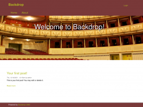
Default hero image = Vienna State Opera, Jiuguang Wang
https://www.flickr.com/photos/jiuguangw/5943433030
Attribution-ShareAlike 2.0 Generic
https://creativecommons.org/licenses/by-sa/2.0/
Current maintainers
- Tim Erickson - Simplo by Triplo
License
This project is GPL v2 software. See the LICENSE.txt file in this directory
for complete text.