Blocks
Blocks are the boxes of content (such as "User Login" or "Main Menu") that are displayed in Layout Regions (such as footer or sidebar) on your page. Everything on a Backdrop web page (with rare exceptions) is a block and can be placed in any region in a layout.
There are two main types of blocks:
- Standard blocks - are made available to your site most commonly by enabling modules.
- Custom blocks - are created by the site user and are essentially text (and image) blocks.
Blocks are placed in regions via the Layout UI page at Admin > Structure > Layouts . Your layout's template defines the regions available. Any block can be placed in any region and can be placed multiple times.
Parts of a block
Viewed on the front end, blocks are built of the following parts
- Block title - the header line at the top of the block which identifies it. The block title may be hidden, so not every block presents a title on the front end. For example, the User login block's title is "User login"; Main menu block does not display a title.
- Block content - the main display content of the block. For example, the Main menu block’s content is the menu links.
- The contextual links - when the mouse hovers over a block in the front end, a small cogwheel appears, over the upper right corner, which when clicked reveals options to manage the block, including a link to configure its settings.
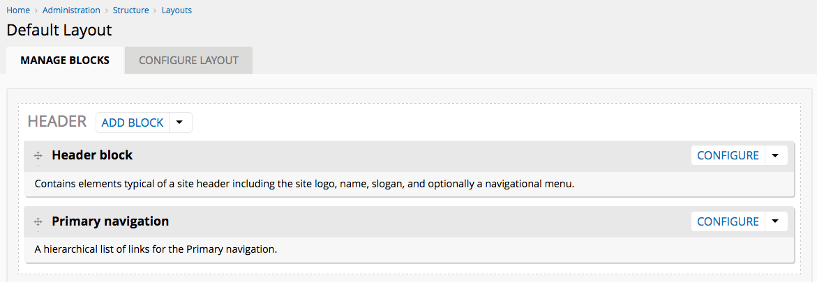
The "Edit Layout" page
The Edit layout page allows you to place blocks in regions via a drag and drop interface. The page elements are as follows:
The page title select
Allows setting a title for the page. The available options are:
- Default title - the page title will be generated by the module providing the page
- Custom title - provides a field to add a title; this will override any title set by modules
- No title - Hides the page title; this will override any title set by modules
The Layout Editor
The layout editor reproduces the positions and proportions of the regions provided by the layout template, and the blocks and blocks positions. Each region is marked by a dotted line and is headed by the region title and a dropbutton with two options:
- Add block - launches the block list to allow selecting a block to insert at this position
- Configure region - provides a form with a textfield to add additional CSS classes to the region
Draggable blocks
Draggable blocks in the Layout Editor regions represent blocks enabled on the page in that region. Each block is headed by the block title and has a brief description area which describes the block. Some blocks may also have a fieldset listing any added visibility conditions set on this block.
Each draggable block also has a dropbutton with, by default, two options:
- Configure - opens the block configuration form
- Remove - removes the block from the region
Saving layout configuration changes
Changes made in the the Edit Layout form and block configuration forms are generally not immediately saved. Layout module stores changes temporarily until the "Save layout" button is finally clicked. Therefore any changes made to the form will cause a message on the form page informing you that changes have not yet been saved. Clicking the "Cancel" button will cancel all changes made but not yet saved.
Block Configuration forms
Clicking "Configure" on a draggable block's dropbutton will launch a popup with a form to configure the block's settings. Settings vary significantly based on the block.
Most block configuration forms, however, will by default show a fieldset for block title type, block style settings, and block conditions.
The Block Title type
This field is present on most blocks and determines the block title display on the page. This is not the page title but the label which appears above the block to identify it when it is being displayed on a Backdrop webpage. The options are:
- Default title - the block title will be generated by the module providing the block
- Custom title - provides a field to add a title; this will override any title set by modules
- No title - Hides the block title; this will override any title set by modules
Note that some blocks by default have no title.
Block style settings
Blocks, like any other website element, are displayed on a page using CSS and HTML to “wrap” the content of the block. The style settings allow external modules to provide alternative “wrappers” for blocks.
Any module can define new ways to wrap blocks and provide form elements to choose settings for the elements used to wrap the block. Backdrop provides two style settings: the Default style, and the Dynamic style.
- Default style - provides a single textfield to input additional CSS classes which will be added to the block's outermost HTML DIV element.
- Dynamic style - provides multiple fields which alter the wrapper elements of blocks and add extra CSS classes.
- Wrapper tag - a select list to determine the HTML tag for the outermost wrapper on the block. The options are:
- DIV
- ASIDE
- SECTION
- P
- No wrapper
- Wrapper classes - a textfield to input additional CSS classes which will be added to the block's outermost HTML DIV element.
- Heading level - a select list to determine the HTML tag for the block header if the block header is not hidden. The options are H1 to H6, plus P tag and DIV
- Heading classes - a textfield to input additional CSS classes which will be added to the block's header
- Content tag - a select list to determine the HTML tag for the block's content wrapper. The options are:
- DIV
- ASIDE
- SECTION
- P
- No wrapper
- Content classes - a textfield to input additional CSS classes which will be added to the block's content wrapper
- Wrapper tag - a select list to determine the HTML tag for the outermost wrapper on the block. The options are:
Visibility conditions
The visibility conditions fieldset contains only the “Add visibility condition” link. Find out more about visibility conditions here.
Custom blocks
Custom blocks are blocks in which the block content is input manually by the site administrator. Custom blocks may also sometimes be called “Text blocks.” This differs from standard blocks in that the content of standard blocks is generated by modules and cannot usually be altered. A custom block might be useful for example for creating an announcement in a sidebar.
Custom blocks are made in the same way as described for other blocks, by clicking the “Add custom block” link in the Layout UI block list. An editor-enabled textarea for adding text will load in the block editing form in the dialog.
Reusing Custom Blocks
A unique feature of Custom blocks, however, is that to use the same Custom block in different layouts they need to be made “reusable”.
Standard blocks are defined by modules, and so the code which builds the content for these blocks is always the same, in every copy of that block, in all layouts. For example, the "Powered by Backdrop" block can be found in the block list of every layout, and when placed in a layout, the block contents will always be the same, anywhere. Custom blocks which are not made reusable will only be placeable on the layout where they are made.
To make a Custom block reusable, a checkbox is labeled “Make this block reusable” is available in the block configuration form which if checked makes this block reusable across different layouts.
For example, if a Custom block is created on the Default layout, it will be placed in that layout and can be moved and saved as usual. Navigating to a new layout, however, will confirm that this particular custom block, with the custom text entered in the Default layout, is not available in this new layout. You would be able to create as many custom blocks as you want, but the content of each block would need to be retyped into the textarea each time. If however it had been made reusable and given an administrative title (see below) of “My reusable block”, visiting any other layout would reveal that a block called “My reusable block” is available in the block list, with the same text content from the first copy of “My reusable block”.
The Custom blocks page
The custom blocks page is a table which lists all custom blocks which have been made reusable. Each block is listed by its Administrative title which may be different from the block title. This is because each Administrative title needs to be unique to identify these blocks accurately, whereas block title may be safely the same on different blocks. For example, you may want a Custom block with the title “Help for this page” on multiple pages but have different content in each block based on the page.
Each block also has a dropbutton with options to:
- Configure - this updates the block contents in every layout where it is being used.
- Delete - this deletes the block in every layout where it is being used.
The Main Content block
The Main content block becomes available in the block list for layouts which use existing paths. See the Layouts documentation for more information on how to create and manage layouts and paths. If you create a layout and use completely new path which did not previously exist, the Main content block will not be available in this layout.
If for example on your site the path ‘/my-fresh-path’ doesn’t exist (you can test this by going to that path on your site; you should get a 403 (Page not found) error) you can still create a layout with this path, and the path will be created for you. The main content block will not be available on this path.
However, the path 'node/%' is an existing Backdrop path (it's the path used for all node content - the % would be the Node ID). If you create a layout with this path, the Main Content block would be available in this new layout. Likewise, since the Default layout is used for all existing paths without their own layout, the Main Content block is available in this layout. If you create a layout for the Site status page at ‘/admin/reports/status’ (this is called ‘overriding’ the path) the Main content block will be available here too.
The Main Content block display
Once included, the main content block displays the original page content for the existing path.
This powerful feature allows you to alter the layout of any Backdrop page. You can add a sidebar to the Site status page and put additional information on this page by adding new blocks to this layout. Or enable the Contact module and override the ‘/contact’ path to add a map to the sidebar and a company photo block above the form.